Blaqk Audio

Wanna show off your Sig/Avatar/artwork. Well this is the place to do it!
Post Reply
User avatar
JK-47


Bloodhound Pyre Socialist Grunge

Posts: 10883
Joined: Wed Dec 01, 2004 2:54 pm
Location: Utah

Blaqk Audio

Post by JK-47 »

Image

I was just listening to Blaqk Audio and decided to make a sig for it. Tell me what you think and what I could improve on, please.
Image
User avatar
Dsoup


Mad Hatter

Posts: 599
Joined: Sun Jan 07, 2007 5:40 pm
Location: Sacramento, California

Post by Dsoup »

Eh.. Not a fan. I think the text needs to be redone, and I'm not really digging some of the effects.
User avatar
Sgt.Peppers


Snitch! Connoisseur

Posts: 2277
Joined: Thu Jul 06, 2006 1:25 pm
Location: Texas

Post by Sgt.Peppers »

Eh, not a fan of the colors there, but it's an alright sig. I'll give it a 6/10.

I like your photography one's better.
User avatar
DisceCruxLogos


Posts: 63
Joined: Fri Aug 17, 2007 3:38 pm

Post by DisceCruxLogos »

I for one fine this style quite intriguing. Especially around the render. Nice job!
Image
Alter ego 2.
User avatar
JK-47


Bloodhound Pyre Socialist Grunge

Posts: 10883
Joined: Wed Dec 01, 2004 2:54 pm
Location: Utah

Post by JK-47 »

Dsoup wrote:Eh.. Not a fan. I think the text needs to be redone, and I'm not really digging some of the effects.
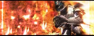
Yeah, I don't really like the text either.. but I'm not sure what to do with it, heh. I'll keep working on it.
Sgt.Peppers wrote:
I like your photography one's better.
As do I, but sometimes there's just nothing to take pictures of ;p
Image
User avatar
V0Lt4Ge


Collaborator Snitch! Socialist

Posts: 3602
Joined: Wed May 12, 2004 4:56 pm
Location: California
Contact:

Post by V0Lt4Ge »

It's the same thing I said about your LP one, I don't like what's going on around his head.
User avatar
JK-47


Bloodhound Pyre Socialist Grunge

Posts: 10883
Joined: Wed Dec 01, 2004 2:54 pm
Location: Utah

Post by JK-47 »

V0Lt4Ge wrote:It's the same thing I said about your LP one, I don't like what's going on around his head.
It is kind of odd... I dunno, I just have a weird way of trying to blend things, heh. I'll get rid of the weird stuff around him.

Image

Update.
Image
User avatar
Dsoup


Mad Hatter

Posts: 599
Joined: Sun Jan 07, 2007 5:40 pm
Location: Sacramento, California

Post by Dsoup »

Man, this is a hard one for text... I'd suggest putting it in an interesting place, and not that visible. Maybe vertically going up his arm, or maybe even on the bottom of the picture frame. It might look cool on his shoulder as well, but you have to be careful with that one.
User avatar
Dr.Cox


Grunge Pyre Mad Hatter

Posts: 4027
Joined: Fri Jun 24, 2005 5:48 pm
Location: Beaverton, Oregon.
Contact:

Post by Dr.Cox »

JK-47 wrote:
V0Lt4Ge wrote:It's the same thing I said about your LP one, I don't like what's going on around his head.
It is kind of odd... I dunno, I just have a weird way of trying to blend things, heh. I'll get rid of the weird stuff around him.

Image

Update.

Jk-47.

2 words

Color Scheme

All those colors are messing the sig up. Make the render and the bg and the "aura" shit blend in. :)

Trust me.
Image
Not removing this 'till I get back. Leaving on [01/05/09]
User avatar
JK-47


Bloodhound Pyre Socialist Grunge

Posts: 10883
Joined: Wed Dec 01, 2004 2:54 pm
Location: Utah

Post by JK-47 »

I didn't exactly choose the colors... They just.. Came out that way ;p
I'll see what I can do about it tomorrow.
Image
User avatar
Dagger13


Posts: 370
Joined: Wed Nov 22, 2006 12:37 pm

Post by Dagger13 »

i dont like anything about it sry
3/10
Image(An Old one.)
User avatar
DRL333


Posts: 1668
Joined: Wed Jul 05, 2006 6:49 pm
Location: Building more Turalbots!

Post by DRL333 »

I don't like the background.
Valve > Bungie
Image
Making abstract graphics again and better than ever!
Post Reply