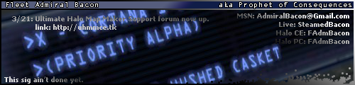
The point of it is that I can continually update the text in it, currently it is being used for UHMM news:

RnC
Oh, and since everything is divided up in the PSD (border, top background, main background, upper border, text blocks), any ideas on improving the overall look of the sig itself? For instance: A different set of colors for the border, perhaps something that goes better with the background? Or a different background gradient for the top?