The first one is alright, but I would stay away from Halo text for sigs. The second one sucks, there's no blending whatsoever, and the colors don't work.
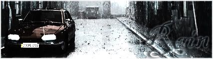
I agree with multpiple genres and Rain. Take out that render and the text and your sig will be pure win. Brushing is awesome. The second one, Only thing I like about it is the border. Not bad for your firsts, though.


