Order & Chaos [WIP]

Wanna show off your Sig/Avatar/artwork. Well this is the place to do it!
Post Reply
User avatar
[cc]z@nd!


Literarian 500

Posts: 2297
Joined: Tue May 04, 2004 1:52 pm
Location: michigan

Order & Chaos [WIP]

Post by [cc]z@nd! »

ok, here's my current final version of the wallpaper. i burned some of the spots that were standing out on the red edge of the moon, added text found on the shirt, and added just a fraction of a light bloom effect on the white area of the moon. here it is:

Image

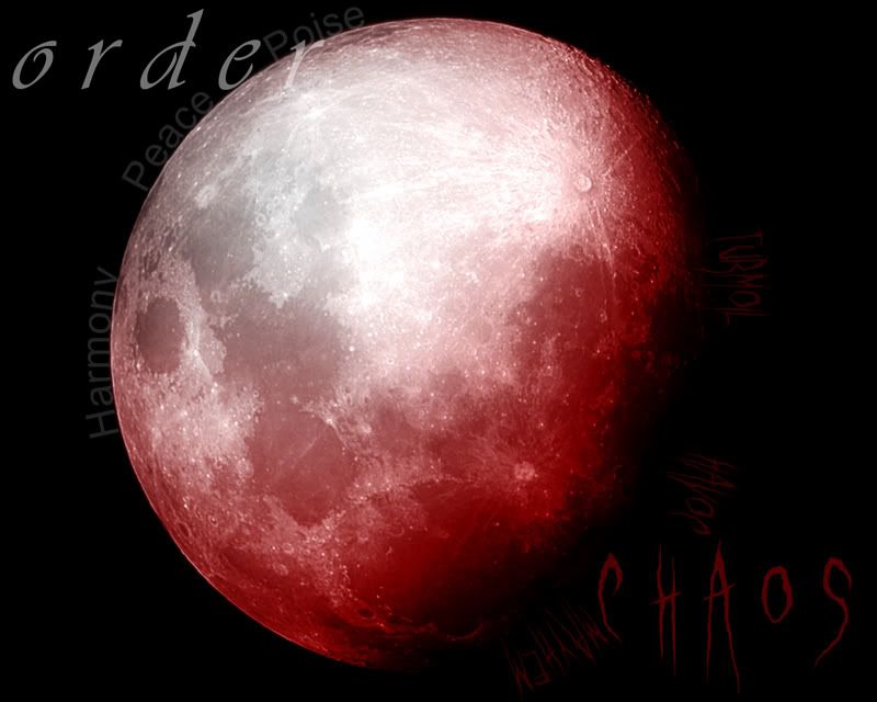
"chaos" text in ghastly panic font found at deviantart.com.
opacity: 59

"order" text in vivaldi font pre-pakaged with photoshop. (is that spelled right?...)
opacity: 54

harmony, peace, and poise text placed using the pen tool to make a path.
opacity: 15-20%

turmoil, havoc, mayhem text placed using the pen tool yet again.
opacity: 20%-ish

contrast/brightness filter. +9 brightness +19 contrast

white->transparent gradient circle, on the order part of the moon where it's white.
blending mode: color
opacity: 54
fill: 83

white->transparent gradient circle right under the other one
blending mode: overlay
opacity: 54
fill: 79

red->transparency inverted circle gradient, to give the chaos side of the moon a red color.
blending mode: color
opacity: 92

red->transparency inverted circle gradient.
blending mode: color burn
opacity: 81
fill: 41

moon render found via images.google.com, gaussian blurred by somewhere around 0.8 pixels.

black background, because the moon render wasn't perfectly 1280x1024.


my focus is the moon (obviously) and i want it to be spot-on perfect, showing the pristine, orderly, proper side of the moon (and marching show) while still having the chaotic red portion as if it's the shadow, thus providing good contrast for the picture, as well as providing interest and portraying the show. i think the text is ok, although mayhem and chaos are just a tad too close.

if anyone can give me constructive criticism, or advice, i'd love it. i feel like this doesn't have very far to go to be finished, but i'm not sure what direction to go in, so if someone can give me a push in the right direction, i'd be very appreciative.

edit: yeah, sorry for the bump, but i'd rather not make a new thread, and i feel like i could really use some advice.
Last edited by [cc]z@nd! on Wed Sep 20, 2006 4:05 pm, edited 1 time in total.
ASPARTAME: in your diet soda and artificial sweeteners. also, it's obviously completely safe. it's not like it will cause tumors or anything. >.>
always remember: guilty until proven innocent
User avatar
Phosphorous


Posts: 1311
Joined: Fri Jul 09, 2004 10:44 am
Location: Installation 04
Contact:

Post by Phosphorous »

Interesting, a bit simple.

I thinkn it would look better is the red was more like flames, maybe add some C4D effect.


But then again, I hate complex backgrounds, too distracting.
Image
User avatar
dos mes


Posts: 2158
Joined: Thu Dec 29, 2005 9:58 pm
Location: Syracuse, NY

Post by dos mes »

Meh, good but I really dislike the "order" text, however teh "Chaos" is good.

7.5/10 considering I blow and couldn't even do that.
User avatar
[cc]z@nd!


Literarian 500

Posts: 2297
Joined: Tue May 04, 2004 1:52 pm
Location: michigan

Post by [cc]z@nd! »

i think it's at least sorta apparent of the effect i'm going for; to capture the effect of a red moon (yes, it exists) while having the calm (and order) or a normal moon. anyone have any other ideas of things i can do with the moon to bring out that effect, do tell.

right now, i think this wallpaper has a ways to go, although what i'm going for doesn't call for anything too detailed, so i'm sorta stuck on what exactly to do now...
ASPARTAME: in your diet soda and artificial sweeteners. also, it's obviously completely safe. it's not like it will cause tumors or anything. >.>
always remember: guilty until proven innocent
Post Reply