Flow

Wanna show off your Sig/Avatar/artwork. Well this is the place to do it!
Post Reply
User avatar
DarkShallFall


Artisan Recreator Trickster Connoisseur
Advisor Pyre Renovator Sigma
Snitch! Enthraller New Age Miner

Posts: 1992
Joined: Fri Jan 20, 2006 2:49 pm
Location: MI, USA
Contact:

Flow

Post by DarkShallFall »

v1
Image
v2
Image
Image
Iron_Forge wrote:I assume I won?..I should get an emblem...
User avatar
CptnNsan0


Stylist Snitch! Collaborator Commentator

Posts: 1904
Joined: Thu Jun 15, 2006 5:49 am
Location: Durham, NC

Post by CptnNsan0 »

Its not a bad style but the text isnt all that great and the lines at the top attract too much attention
User avatar
Dsoup


Mad Hatter

Posts: 599
Joined: Sun Jan 07, 2007 5:40 pm
Location: Sacramento, California

Post by Dsoup »

Line lines contradict the style and the look I think you were going for.
User avatar
Keablr


Posts: 343
Joined: Thu Jul 07, 2005 8:57 pm
Location: Chicago
Contact:

Post by Keablr »

Wait a minute?!? Is DARKSHALLFALL your gamertag??? You should take those line at the top and the bottom. Other than that mt likey.
Image
-DeToX-


Illusionist Recreator Connoisseur Acolyte
Sigma Decryptor Droplet Pyre
Blacksmith Socialist New Age System Engineer
ONI

Posts: 4589
Joined: Sun Jun 18, 2006 3:58 pm
Location: ...

Post by -DeToX- »

Yes DarkShallFall is his gamertag.

How is that relevant to the topic though?..
Image
User avatar
Keablr


Posts: 343
Joined: Thu Jul 07, 2005 8:57 pm
Location: Chicago
Contact:

Post by Keablr »

Well it is his current signature. And I was wondering because I remembered playing versus DARKSHALLFALL on Standoff, and I say his name and I new it looked familiar so I sent him a friend request.

And I did comment on his signature flow.
Image
User avatar
noscottno


Orb Snitch! Mad Hatter Commentator

Posts: 2175
Joined: Thu Aug 10, 2006 7:33 pm
Location: Sacramento, CA
Contact:

Post by noscottno »

Not enough flow.
User avatar
maca_§


Grunge

Posts: 5357
Joined: Mon Jan 19, 2004 8:54 pm
Location: Australia
Contact:

Post by maca_§ »

noscottno wrote:Not enough flow.
Yeah the name doesn't really match the sig.. It's almost the exact opposite :p.
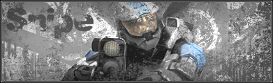
Otherwise I really don't like it sorry.. It's too busy and messy and the colours just don't mix.
  • Image
halobuddha


Posts: 834
Joined: Fri Oct 07, 2005 4:46 pm
Location: running around like a chicken w/o a head

Post by halobuddha »

I was about to say that :(! lol anyways you should set the text layers opacity down a little or maybe change the blending mode.
Image
Post Reply