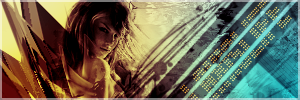
bubble + prison

Wanna show off your Sig/Avatar/artwork. Well this is the place to do it!
Post Reply
User avatar
plushiefire


Posts: 618
Joined: Thu Nov 23, 2006 12:10 pm
Location: Canada

Post by plushiefire »

I like the red art in bubble, but I think the green on the planet throws it off. Just my opinion. Did you hand draw prison? If you did, good job :D.

And, how did you make the red on bubble, the red art looks so nice!
Come check out Team 3volved.
Image
User avatar
Titusz


Grunge Mad Hatter

Posts: 549
Joined: Wed Nov 29, 2006 8:04 am

Post by Titusz »

Artist's Comments
this mind is a prison
this body is a cell
limiting and
restrictive
and bitter, all around.

--

various pieces, hand drawn, vector, and stock.
The red in bubble is a C4D.

Awesome work as always.
Prachtig =D
Image
<---OMFG, they're breeding
User avatar
plushiefire


Posts: 618
Joined: Thu Nov 23, 2006 12:10 pm
Location: Canada

Post by plushiefire »

This is gunna sound bad..But what is C4D...
Come check out Team 3volved.
Image
User avatar
Titusz


Grunge Mad Hatter

Posts: 549
Joined: Wed Nov 29, 2006 8:04 am

Post by Titusz »

http://elementsunleashed.deviantart.com ... 1-40562597
those are examples of C4D's, they are often used to create effects in sigs or LP's or in a great abstract work =D

EDIT:
And they are made with a program called Cinema 4 D(sumthingsumthing)
Hence the name C4D
Image
<---OMFG, they're breeding
User avatar
SHOUTrvb


Socialist Snitch! Advisor Orb
Mad Hatter Connoisseur Pyre

Posts: 3934
Joined: Sun Feb 13, 2005 11:13 am
Contact:

Post by SHOUTrvb »

Prison I saw, but you never showed me Bubble. I don't like the text in Bubble, but they both look great. Prison reflects an appealing sense of darkness.
User avatar
GametagAeonFlux


Bloodhound Acolyte Orb Commentator
Pyre Socialist

Posts: 9320
Joined: Sun Jun 06, 2004 7:27 pm
Location: Lincoln, NE

Post by GametagAeonFlux »

They both look awesome, I like your style of drawing. :P
User avatar
-Legendary-


Recreator Connoisseur Renovator Mad Hatter
Snitch!

Posts: 2272
Joined: Mon Aug 02, 2004 8:06 pm
Location: SC
Contact:

Post by -Legendary- »

The first ones colors, I just don't like. I never have liked them. But awesome design none the less. And the second one, heh, reminds me of picture just stored in my mind.

Good job on them both.
Image
halobuddha


Posts: 834
Joined: Fri Oct 07, 2005 4:46 pm
Location: running around like a chicken w/o a head

Post by halobuddha »

they look nice and prison kind of reminds me of a background i saw once called building the future. You might be able to find it on google.
Image
User avatar
gh0570fchurch


Snitch!

Posts: 3374
Joined: Sat Oct 01, 2005 11:04 am
Location: San Diego Area, CA
Contact:

Post by gh0570fchurch »

When it comes to bright colors, I wouldn't put warm and cool colors right next to each other.

I really like the second one.
Image
Dr.Cox wrote:gh0570fchurch has a mexi-stash. =D
Post Reply