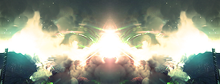
Right side is fine. I think the left should be more blended in the back of his head. The floral pattern was a good idea, but think upping the contrast levels of the left side to match the render and removing the floral altogether would be a better idea. Very nice sig though. Wouldn't be a bad LP if you managed to pull it off.
Thanks for the comments, and thanks for the constructive critisism SHOUT, I really appreciate it, but the contrasting of the left idea, it was already like that, but I changed it because it ended up looking better this way to me, and the back of his head starts to lose contrast and fade into black.
But that is probably just me, I'll take that into consideration next time when I blend a signature such as this. Thank you.
EDIT: Directed at Thirst: Go ahead. Enjoy ;P
Last edited by -DeToX- on Sun Nov 04, 2007 7:04 am, edited 1 time in total.


