Wanna show off your Sig/Avatar/artwork. Well this is the place to do it!
JK-47
Posts: 10883 Joined: Wed Dec 01, 2004 2:54 pmLocation: Utah
Post
by JK-47 Mon Nov 05, 2007 3:31 pm
I was just messin around in photoshop with a picture of a combine and some other things, and came up with this:
What do you think...?
gh0570fchurch
Posts: 3374 Joined: Sat Oct 01, 2005 11:04 amLocation: San Diego Area, CA
Contact:
Post
by gh0570fchurch Mon Nov 05, 2007 3:35 pm
Turn down the contrast and work on the colors a bit, and you've got yourself a pretty good brush sig. A more significant focal point would be nice, too.
Dr.Cox wrote: gh0570fchurch has a mexi-stash. =D
{TP}Spartan
Posts: 1543 Joined: Fri Dec 22, 2006 9:09 pmLocation: In a place,with some people,and an xbox.OMG THIS GUY HAS AN XBOX.
Post
by {TP}Spartan Mon Nov 05, 2007 4:03 pm
it looks a little too busy on the left side need more on the right
CabooseJr
Posts: 4592 Joined: Wed May 11, 2005 8:09 amLocation: Valve knows a lot about my cookies.
Contact:
Post
by CabooseJr Mon Nov 05, 2007 4:21 pm
It looks like you followed Titusz's tutorial.
JK-47
Posts: 10883 Joined: Wed Dec 01, 2004 2:54 pmLocation: Utah
Post
by JK-47 Mon Nov 05, 2007 4:38 pm
I'll try to make it a bit more simple, and work on a more solid color, and I didn't use brushes, or a tutorial :p
gh0570fchurch
Posts: 3374 Joined: Sat Oct 01, 2005 11:04 amLocation: San Diego Area, CA
Contact:
Post
by gh0570fchurch Mon Nov 05, 2007 4:42 pm
Hmm, looks a lot like brushes. I still stand by what I said, just except for the brushes bit. Reminds me of a sig I made a long time ago:
Ugh.
Dr.Cox wrote: gh0570fchurch has a mexi-stash. =D
Kirk
Posts: 6031 Joined: Wed Jan 21, 2004 10:54 pmLocation: Alaska
Post
by Kirk Mon Nov 05, 2007 4:47 pm
Colors are a bit weird.
JK-47
Posts: 10883 Joined: Wed Dec 01, 2004 2:54 pmLocation: Utah
Post
by JK-47 Mon Nov 05, 2007 4:50 pm
gh0570fchurch wrote: Hmm, looks a lot like brushes. I still stand by what I said, just except for the brushes bit. Reminds me of a sig I made a long time ago:
Ugh.
They're renders I made :p
Here's a newer version:
CabooseJr
Posts: 4592 Joined: Wed May 11, 2005 8:09 amLocation: Valve knows a lot about my cookies.
Contact:
Post
by CabooseJr Mon Nov 05, 2007 4:53 pm
That looks much better.
gh0570fchurch
Posts: 3374 Joined: Sat Oct 01, 2005 11:04 amLocation: San Diego Area, CA
Contact:
Post
by gh0570fchurch Mon Nov 05, 2007 4:57 pm
Ooh, much better. Maybe a little more of a focal point on the render. Maybe blur the background slightly (very) and sharpen the render about the same amount. The render might be better off to the left a bit instead of in the center as well.
Dr.Cox wrote: gh0570fchurch has a mexi-stash. =D
JK-47
Posts: 10883 Joined: Wed Dec 01, 2004 2:54 pmLocation: Utah
Post
by JK-47 Mon Nov 05, 2007 5:46 pm
I can't move the combine without messing up the sig, but I blurred the background to add a focus to the combine a little:
gh0570fchurch
Posts: 3374 Joined: Sat Oct 01, 2005 11:04 amLocation: San Diego Area, CA
Contact:
Post
by gh0570fchurch Mon Nov 05, 2007 5:47 pm
Hmm, it's better than it was before. I rather like it.
Dr.Cox wrote: gh0570fchurch has a mexi-stash. =D
Dsoup
Posts: 599 Joined: Sun Jan 07, 2007 5:40 pmLocation: Sacramento, California
Post
by Dsoup Mon Nov 05, 2007 6:15 pm
The pink on his forehead is gross, but other than that it's pretty good.
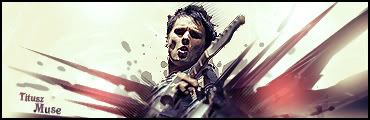
Titusz
Posts: 549 Joined: Wed Nov 29, 2006 8:04 am
Post
by Titusz Tue Nov 06, 2007 4:23 am
A couple of adjustment layers and it'll look awesome
Ω ☻ <---OMFG, they're breeding
SHOUTrvb
Posts: 3934 Joined: Sun Feb 13, 2005 11:13 am
Contact:
Post
by SHOUTrvb Tue Nov 06, 2007 6:28 am
Why would he add adjustment layers?
I think the text sticks out a little too much, but I really like the sig. It's pretty fantastic.
Titusz
Posts: 549 Joined: Wed Nov 29, 2006 8:04 am
Post
by Titusz Tue Nov 06, 2007 9:31 am
To get the ugly pink out.
Ω ☻ <---OMFG, they're breeding
JK-47
Posts: 10883 Joined: Wed Dec 01, 2004 2:54 pmLocation: Utah
Post
by JK-47 Tue Nov 06, 2007 6:58 pm
I'll try to get the pink out, even though I don't see the problem :p
SHOUTrvb
Posts: 3934 Joined: Sun Feb 13, 2005 11:13 am
Contact:
Post
by SHOUTrvb Tue Nov 06, 2007 8:19 pm
The pink adds to it. I'm not seeing what Titusz sees apparently. The current has a ton of depth, which is great. Other than fixing the text, I'd say you're done and should current.
JK-47
Posts: 10883 Joined: Wed Dec 01, 2004 2:54 pmLocation: Utah
Post
by JK-47 Tue Nov 06, 2007 8:30 pm
Like dis?


![[x]](http://img255.imageshack.us/img255/3713/fearck7.jpg)
![[x]](http://img246.imageshack.us/img246/8220/rb6vzo3.jpg)
![[x]](http://img504.imageshack.us/img504/7088/bustawolfrb3.jpg)