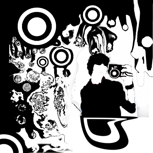
youhoo7:
Overall, I like it, but it does seem a bit busy. Some of the edges are really aliased, but still not bad.
Mine:
The stock seems a bit big, but I couldn't change the size of it. It was intended to be a projectile weapon of some sort, but I hadn't decided what it was specifically.
Tomclancey:
The hat and face are blended terribly. Hat is blurred, face is sharp.
Pepsi711:
Eww, the blending is bleh, and the lighting is way messed up.
Titusz:
Too dark, kind of hard to see what's going on. I like the concept, though.
cryticfarm:
The shadow makes it seem like the hat is in front of the head instead of on it.
Dsoup:
Parts of it are badly aliased, but the concept is really nice. I also don't really like how the pick-guard goes under the strings. Just seems unnecessary, but there was not really anything you could've done about it.
theycallmechad:
I dunno, there's something I just don't like about it.
 -Legendary-:
Overly simple, and nothing interesting going on.
Sgt. Peppers:
Overall, pretty good. Colors could be better, though.
My vote is for Sgt. Peppers.


