I know this is not nearly as good as you people who have mad skillz with photoshop, but this was not created with photoshop either.
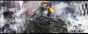
Tell me what you think. I was having trouble giving the 2.5 logo a good place\look, so not sure if it is good or bad where it is. For some reason it is blurring a little bit but oh well.
I thought this was just a funny thing to make real fast
Last edited by Rockymods on Thu Oct 18, 2007 8:31 pm, edited 1 time in total.
or move it? nice work rocky i have some good ones but there on the schools comp, and well halomods and anything with the name halo in it is blocked at our school
newbymodder wrote:or move it? nice work rocky i have some good ones but there on the schools comp, and well halomods and anything with the name halo in it is blocked at our school
ur principle shud b shot. anyways i like the sig, may not like red so much but the sig is great.


