Creativity is Key

Wanna show off your Sig/Avatar/artwork. Well this is the place to do it!
Post Reply
Infern0


Designer Pyre

Posts: 1929
Joined: Tue Jul 13, 2004 10:57 am

Creativity is Key

Post by Infern0 »

http://oletim.deviantart.com/art/Creati ... r-67580904

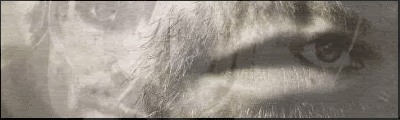
Kind of a minimalistic wallpaper I made for myself, nothing really special.. But I was just hoping to get some criticism about what is missing.
No unneeded criticism like "I don't like it" - That's fine, but that's not the reason why I'm posting this. Just want to improve, so please provide some good criticism. ;)

Comments on my dA page are very welcome, and please check out my DevID too, while you're at it :)

Thanks in advance.
Image
User avatar
killarzachary


Coagulator Recreator Snitch!

Posts: 934
Joined: Sat Mar 03, 2007 9:26 am
Location: High School
Contact:

Post by killarzachary »

I don't know why, I just don't like it. I don't even see it as creative really.
Image
User avatar
Sgt.Peppers


Snitch! Connoisseur

Posts: 2277
Joined: Thu Jul 06, 2006 1:25 pm
Location: Texas

Post by Sgt.Peppers »

I don't care for the colors.
Infern0


Designer Pyre

Posts: 1929
Joined: Tue Jul 13, 2004 10:57 am

Post by Infern0 »

Uhm.. Thanks for helping me improve on parts where I am not so good in? :x
Image
User avatar
youhoo7


Posts: 1021
Joined: Fri Oct 27, 2006 2:53 pm

Post by youhoo7 »

its ok i guess
Image
We
User avatar
BEEF!!!


Pyre

Posts: 1496
Joined: Wed Nov 05, 2003 5:47 pm
Location: Berlin, MA

Post by BEEF!!! »

I like the concept. But, like stated before, colors need a little work. If I were you, I would just go white background and maybe work from there IMO. If you're piece is supposed to be simplistic, than use simplistic colors. That green is just a bit to 'active' I guess you could say.
Infern0


Designer Pyre

Posts: 1929
Joined: Tue Jul 13, 2004 10:57 am

Post by Infern0 »

BEEF!!! wrote:I like the concept. But, like stated before, colors need a little work. If I were you, I would just go white background and maybe work from there IMO. If you're piece is supposed to be simplistic, than use simplistic colors. That green is just a bit to 'active' I guess you could say.
Alright, thanks man. I could work from that piece of info.. ;p
Hmm, it's a bit too late for me to work on it right now, but I'll suppose I'll edit it some more.. :)
Image
Post Reply