trying out a new style

Wanna show off your Sig/Avatar/artwork. Well this is the place to do it!
Post Reply
User avatar
CptnNsan0


Stylist Snitch! Collaborator Commentator

Posts: 1904
Joined: Thu Jun 15, 2006 5:49 am
Location: Durham, NC

trying out a new style

Post by CptnNsan0 »

Ok I wanted to try some stuff in photoshop. Tell me if I did decent. The only difference between the 3 is a photofilter.

Image
Image
Image

Give a rating -/10 please
Image
Not Removing This
User avatar
D4rkFire


Connoisseur

Posts: 702
Joined: Wed Oct 04, 2006 11:46 am
Location: Florida

Post by D4rkFire »

I think it would look better without a render.
Image
User avatar
SHOUTrvb


Socialist Snitch! Advisor Orb
Mad Hatter Connoisseur Pyre

Posts: 3934
Joined: Sun Feb 13, 2005 11:13 am
Contact:

Post by SHOUTrvb »

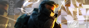
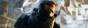
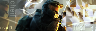
Interesting, I like it. I don't much like the randomness of the rectangles, but the simplicity of the left side looks nice. Edit: And the render looks alright in my opinion, but I think you blurred the left side of the chief too much.
User avatar
CptnNsan0


Stylist Snitch! Collaborator Commentator

Posts: 1904
Joined: Thu Jun 15, 2006 5:49 am
Location: Durham, NC

Post by CptnNsan0 »

I was thinking that too but I didn't save my psd file :(
Image
Not Removing This
User avatar
DJ_Gnomey


Connoisseur

Posts: 490
Joined: Sun Apr 15, 2007 9:31 am
Location: New York
Contact:

Post by DJ_Gnomey »

Actually. Looking at how the colors wouldn't go right on the left, it would actually benefit the fact that you didn't recolor the render so it would be a nicer color to it. Like a white spartan with a golden visor and a golden trim.That would have looked nicer. Seeing how this style is my favorite though, I will let that go. The shapes fit in nicely in some spots, others they are randomly placed in.

Overall a 10/10
Image
Nitemare


Posts: 278
Joined: Sun Oct 22, 2006 5:01 am
Location: USA

Post by Nitemare »

i dont like the cheif ur using but 8/10
Image
Post Reply