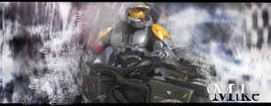
Don't really like the text. It seems like it would be more "poetic" without it. Maybe also add a border. Also, I don't quite like the transition area between the Dragon and Griffen. I think I can see a seam(sp?) line.
WaywornMmmmm wrote:Don't really like the text. It seems like it would be more "poetic" without it. Maybe also add a border. Also, I don't quite like the transition area between the Dragon and Griffen. I think I can see a seam(sp?) line.
You should try to focus on one single thing in a sig, well in this case, and you have 2 things that don't really fit together. Apart from that you should make it more interesting then just one color.
WaywornMmmmm wrote:Don't really like the text. It seems like it would be more "poetic" without it. Maybe also add a border. Also, I don't quite like the transition area between the Dragon and Griffen. I think I can see a seam(sp?) line.
Overall 7.5/10
more like 4/10
there just renders. and shitty renders. sorry.
Not removing this 'till I get back. Leaving on [01/05/09]
WaywornMmmmm wrote:Don't really like the text. It seems like it would be more "poetic" without it. Maybe also add a border. Also, I don't quite like the transition area between the Dragon and Griffen. I think I can see a seam(sp?) line.
Overall 7.5/10
more like 4/10
there just renders. and *** renders. sorry.
Dude, you don't need to be an ass about it. Its your personl thought that counts what you think, not what other people think, and besides aren't all sigs renders?
First of all, No. Second of all, that is my presonal Opinion. I don't like that fact that you stuck 2 renders(which by the way is a big no-no) on to a red canvas and brushed over. That's why I gave you a 4/10.
Not removing this 'till I get back. Leaving on [01/05/09]


