It still has the same feel as all your other sigs. Overlapping text, messy splatter-like background, one lens flare thingy in between the render and the text, and a shallow, restricted palette.
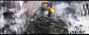
Ignoring all that, it's probably the worst of the style. The right side looks ugh and the left side's dark spot hits the text in an unappealing way. Also the render itself is totally unrecognizable to me. I can't tell what it is.
It's mainly the right side. The lines looks like bad gradients, and the image quality of the background was reduced dramatically. Left side is alright still, but the bottom left has some bad sharp spots. I should have clarified, so that was my bad. It's not really terrible either, but I was comparing it to what your sigs usually look like (which usually look great).
It's really odd sometimes, when I jus finish making something it looks really good, and when i look back at it, i just go wtf.
Sometimes when I post sigs I think people will go 10/10 BEST SIG EVAR!!
but when I look back at them I go wtf.
my other style was good, but I shouldnt have made every second person a sig.
I did get repative, but I figured hey it works, but i think I pushed the last straw.
But I picked up a lot of stuff, I'm interested in cleaner sigs not, not like this one.
I wanna make something simple but complex at the same time.
I'm figuring out how to go about that right now, this was a missed shot, hopefully I'll it the target soon, but it's harder with school.
Thanks for the comment, I don't midn you telling me its terrible, because then i know I did something really wrong and I realize that.
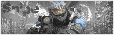
The last one looked fine to me, except the glow thing interferes with his lighting so you get the feeling that you're looking at his face and everything is wrong and then after you look at it for a while you see that he's facing the other way.


