Wanna show off your Sig/Avatar/artwork. Well this is the place to do it!
Guest
Posts: 1098 Joined: Mon Jul 02, 2007 10:52 amLocation: xbox
Contact:
Post
by Guest Mon Sep 03, 2007 9:55 am
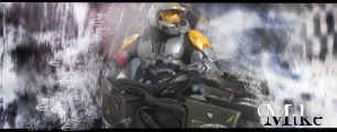
just playing around with paint.net and came up with this nothing much i know but thought id like a opinion because i might retry the technique with a different render hope you like it!
thanks for the sig dagger12 ill give you something someday, maybe.
V0Lt4Ge
Posts: 3602 Joined: Wed May 12, 2004 4:56 pmLocation: California
Contact:
Post
by V0Lt4Ge Mon Sep 03, 2007 9:57 am
Ugly colors, incredibly plain, bad and hard to see text, bulky.
Just all of the above really. Look up some tutorials for whatever you're using.
Sgt.Peppers
Posts: 2277 Joined: Thu Jul 06, 2006 1:25 pmLocation: Texas
Post
by Sgt.Peppers Mon Sep 03, 2007 9:58 am
It's too big, and there's too much empty space, it's just boring.
Guest
Posts: 1098 Joined: Mon Jul 02, 2007 10:52 amLocation: xbox
Contact:
Post
by Guest Mon Sep 03, 2007 10:03 am
i know about the dark space i can fix that with my next render and i put the text to far over i know that i wanted it to fade out like that so ya. just a test.
thanks for the sig dagger12 ill give you something someday, maybe.
DRL333
Posts: 1668 Joined: Wed Jul 05, 2006 6:49 pmLocation: Building more Turalbots!
Post
by DRL333 Mon Sep 03, 2007 10:06 am
V0Lt4Ge wrote: Ugly colors, incredibly plain, bad and hard to see text, bulky.
Valve > Bungie
Making abstract graphics again and better than ever!
Xiion
Posts: 2230 Joined: Sat Jul 09, 2005 11:22 amLocation: Uhhh Uhm uhhh... NO WHEREZ!!
Contact:
Post
by Xiion Mon Sep 03, 2007 10:22 am
looks like anikan skywalker to me
Yoda117
Posts: 105 Joined: Mon Jun 11, 2007 12:14 pmLocation: None yo biz!
Post
by Yoda117 Mon Sep 03, 2007 10:27 am
that looks ugly man sorry but it dont even look like luke
thanks dragon248 for the sig
Sarb
Posts: 1225 Joined: Tue Aug 23, 2005 11:51 amLocation: Canada
Post
by Sarb Mon Sep 03, 2007 10:28 am
Looks more like a banner, an ugly banner, theres nothing to like about it, it's too simple.
reanimation-06
Posts: 388 Joined: Mon Mar 19, 2007 2:49 pmLocation: Middle of nowhere...
Post
by reanimation-06 Mon Sep 03, 2007 10:32 am
i think he gets the point
How to save a life...
SHOUTrvb
Posts: 3934 Joined: Sun Feb 13, 2005 11:13 am
Contact:
Post
by SHOUTrvb Mon Sep 03, 2007 10:44 am
Your text style is pretty nice. Works well with the background. Still, I'm afraid the render simply doesn't work with the simple background. Needs more umfth if you understand what I mean. (fill it in more)
Guest
Posts: 1098 Joined: Mon Jul 02, 2007 10:52 amLocation: xbox
Contact:
Post
by Guest Mon Sep 03, 2007 11:49 am
i know i need a better render but i want opinions on the color and text sceme, i wanted the text to fade out like it does and have the light from the left also when i start his fae was pure wight. the render is horrible and i know its incredabley simple its just a test im testing certain abilitys of my program thats similar to photoshop but extremely different in some ways.
thanks for the sig dagger12 ill give you something someday, maybe.
DoorM4n
Readers Club Posts: 2530 Joined: Mon Aug 15, 2005 2:48 pmLocation: Smurf Village Team: Team DeFiance
Post
by DoorM4n Mon Sep 03, 2007 11:59 am
isnt that anakin skywalker?
The maximum signature size is 500x120px at 75kb.
CabooseJr
Posts: 4592 Joined: Wed May 11, 2005 8:09 amLocation: Valve knows a lot about my cookies.
Contact:
Post
by CabooseJr Mon Sep 03, 2007 12:20 pm
What are you, new to photoshop?
D4rkFire
Posts: 702 Joined: Wed Oct 04, 2006 11:46 amLocation: Florida
Post
by D4rkFire Mon Sep 03, 2007 12:33 pm
He said he was using Paint.net.
Guest
Posts: 1098 Joined: Mon Jul 02, 2007 10:52 amLocation: xbox
Contact:
Post
by Guest Mon Sep 03, 2007 1:02 pm
ya paint.net is same in many ways and different in many ways. and i dont know if its anakin it might i don't remember who it wad.
thanks for the sig dagger12 ill give you something someday, maybe.
Dsoup
Posts: 599 Joined: Sun Jan 07, 2007 5:40 pmLocation: Sacramento, California
Post
by Dsoup Mon Sep 03, 2007 1:39 pm
Plain, Ugly, Boring.
Guest
Posts: 1098 Joined: Mon Jul 02, 2007 10:52 amLocation: xbox
Contact:
Post
by Guest Mon Sep 03, 2007 1:41 pm
guys its nice to have a comuntity thats not afraid to say that picture ****ING sucks! thanks all your criticism is apreciated
thanks for the sig dagger12 ill give you something someday, maybe.
Dsoup
Posts: 599 Joined: Sun Jan 07, 2007 5:40 pmLocation: Sacramento, California
Post
by Dsoup Mon Sep 03, 2007 1:56 pm
...uh....
gh0570fchurch
Posts: 3374 Joined: Sat Oct 01, 2005 11:04 amLocation: San Diego Area, CA
Contact:
Post
by gh0570fchurch Mon Sep 03, 2007 1:59 pm
[quote="
Dr.Cox wrote: gh0570fchurch has a mexi-stash. =D


