

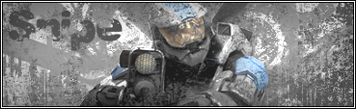
If you have any suggestions on how to improve it, please post. I'm sure that no one's going to like the bottom text that says JK-47. I messed around with some distortion settings in an attempt to blend it in with the sig; I personally like it, but if enough people think it looks wierd, I'll fix it. Oh, and please say nothing about the render, I'm aware it's whored
Anyways, please comment, rate, give advice, or whatever :]
EDIT: I fixed the text.
V2:


