Infinite View

Wanna show off your Sig/Avatar/artwork. Well this is the place to do it!
Post Reply
Tsuin Taiyou


Vector

Posts: 991
Joined: Fri Sep 03, 2004 12:07 pm
Contact:

Infinite View

Post by Tsuin Taiyou »

Version 1:
Image

Version 2:
Image


Comments and criticism welcome.
Image
User avatar
GametagAeonFlux


Bloodhound Acolyte Orb Commentator
Pyre Socialist

Posts: 9320
Joined: Sun Jun 06, 2004 7:27 pm
Location: Lincoln, NE

Post by GametagAeonFlux »

I like v1 better than v2. I still like v2, but if I had to choose, I'd say v1.

Anyway, looks very nice, I say you work on an even larger canvas and expand this piece...it seems like this is only part of a whole piece.
User avatar
Keablr


Posts: 343
Joined: Thu Jul 07, 2005 8:57 pm
Location: Chicago
Contact:

Post by Keablr »

They both are awesome but v1 is way better, love v1 it is amazing :shock:
Image
User avatar
maca_§


Grunge

Posts: 5357
Joined: Mon Jan 19, 2004 8:54 pm
Location: Australia
Contact:

Post by maca_§ »

That's some awesome painting :).
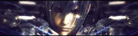
The first one's definatly best but I'd say get rid of the planet for both.. doesn't match the scene at all and shadow is way too harsh.

Good job overall.
  • Image
User avatar
kibito87


Stylist Connoisseur Advisor Bloodhound
Droplet Articulatist 500

Posts: 3461
Joined: Mon Feb 21, 2005 7:49 pm
Location: Ohio
Contact:

Post by kibito87 »

i like v2.
Image
User avatar
TomClancey


Posts: 2565
Joined: Sat Jan 28, 2006 6:49 am
Location: Ohio
Contact:

Post by TomClancey »

Wow, very nice. I <3 v1, but v2 is still good. Also as others said the planet doesn't seem to fit real well.
User avatar
gh0570fchurch


Snitch!

Posts: 3374
Joined: Sat Oct 01, 2005 11:04 am
Location: San Diego Area, CA
Contact:

Post by gh0570fchurch »

Really good. I especially like the shadow cast by the planet on the right side... :D
Image
Dr.Cox wrote:gh0570fchurch has a mexi-stash. =D
Tsuin Taiyou


Vector

Posts: 991
Joined: Fri Sep 03, 2004 12:07 pm
Contact:

Post by Tsuin Taiyou »

Lol, I'm looking at them from my sister's computer and I see what you guysmean by the shadow...It didn't look too harsh on my computer. I'll fix it later.
Image
User avatar
Xiion


Orb

Posts: 2230
Joined: Sat Jul 09, 2005 11:22 am
Location: Uhhh Uhm uhhh... NO WHEREZ!!
Contact:

Post by Xiion »

i see alot that can be better, but its better than all of your latest things. you should paint on a bigger canvas.
Image
Xiion GFX|Store|D-G|Moola|LAWLZ
Xiion: Pronounced as Ecks-See-Ohn.
User avatar
G.I.R.


Recreator Coroner

Posts: 3221
Joined: Thu Aug 11, 2005 1:07 pm
Location: Missouri
Contact:

Post by G.I.R. »

Looks great; I love alot of your work, Tsuin.
Image
I think Noobraska is a pretty cool state. eh grows corn and doesn't afraid of anythng.
(12:18:11 AM) GTAF: DAMNIT GIR WE ARE ON THE SUBJECT OF VINCE'S DICK.
User avatar
Cuda


Grunge

Posts: 5725
Joined: Tue Oct 18, 2005 2:59 pm
Location: Torrance, CA

Post by Cuda »

Get the text away from the focal. try putting it in the low right hand corner with a light off-black(Reaally dark Purple) color.


#s: 3f3638 or 52373a
Image
Post Reply