Wanna show off your Sig/Avatar/artwork. Well this is the place to do it!
Lt Slap a ho
Posts: 541 Joined: Sat Jun 10, 2006 6:34 pm
Post
by Lt Slap a ho Mon Jan 01, 2007 7:23 pm
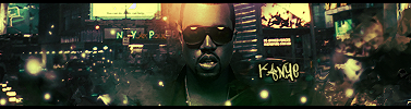
This is the outcome:
Enjoy
I'M IN UR POST TOO, ADDIN' IT TO DA TUT INDEX. :p - Kay_Bee
Last edited by
Lt Slap a ho on Mon Jan 01, 2007 8:36 pm, edited 2 times in total.
Sarb
Posts: 1225 Joined: Tue Aug 23, 2005 11:51 amLocation: Canada
Post
by Sarb Mon Jan 01, 2007 7:25 pm
Nice, I wanted to see a tut for this one.
T1xAnton
Posts: 1213 Joined: Sat Mar 25, 2006 8:54 pmLocation: Corbin, KY
Contact:
Post
by T1xAnton Mon Jan 01, 2007 7:26 pm
Thats right. Best sig tutorial ever written
Accept Change.
GametagAeonFlux
Posts: 9320 Joined: Sun Jun 06, 2004 7:27 pmLocation: Lincoln, NE
Post
by GametagAeonFlux Mon Jan 01, 2007 7:29 pm
Ugh...please never use "pro" when describing any aspect of a sig.
noscottno
Posts: 2175 Joined: Thu Aug 10, 2006 7:33 pmLocation: Sacramento, CA
Contact:
Post
by noscottno Mon Jan 01, 2007 7:30 pm
Thanks.
Lt Slap a ho
Posts: 541 Joined: Sat Jun 10, 2006 6:34 pm
Post
by Lt Slap a ho Mon Jan 01, 2007 7:32 pm
GametagAeonFlux wrote: Ugh...please never use "pro" when describing any aspect of a sig.
Your just jealous
I changed it for ya.
Sarb
Posts: 1225 Joined: Tue Aug 23, 2005 11:51 amLocation: Canada
Post
by Sarb Tue Jan 02, 2007 11:03 am
My outcome:
RaVNzCRoFT
Posts: 6208 Joined: Mon Jan 10, 2005 3:05 pmLocation: Raleigh, North Carolina, USA
Post
by RaVNzCRoFT Tue Jan 02, 2007 11:10 am
Cool method. I think your outcome is a little busy, Lieutenant.
GametagAeonFlux
Posts: 9320 Joined: Sun Jun 06, 2004 7:27 pmLocation: Lincoln, NE
Post
by GametagAeonFlux Tue Jan 02, 2007 11:23 am
I'M THE LIEUTENANT HERE DANGIT.
0mfc0
Posts: 218 Joined: Sun May 07, 2006 11:10 amLocation: Indiana
Post
by 0mfc0 Tue Jan 02, 2007 11:53 am
Looks ok
Ketchup_Bomb
Posts: 3374 Joined: Thu Mar 18, 2004 7:52 pmLocation: ¯\ ( º _ o ) /¯
Contact:
Post
by Ketchup_Bomb Tue Jan 02, 2007 12:03 pm
I'M IN UR POLL, HO.
Tutorial added.
Hawaiian Modder
Posts: 2154 Joined: Sat Nov 26, 2005 7:17 pmLocation: In a cave smokin up with tupac and big foot.
Post
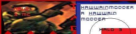
by Hawaiian Modder Tue Jan 02, 2007 12:05 pm
I thought it was diddy in the sig.>_<
Thanks lej for the sig.
Dr.Cox wrote: I like Cox.
noscottno
Posts: 2175 Joined: Thu Aug 10, 2006 7:33 pmLocation: Sacramento, CA
Contact:
Post
by noscottno Tue Jan 02, 2007 1:53 pm
377 x 1000!!!!!
RaVNzCRoFT
Posts: 6208 Joined: Mon Jan 10, 2005 3:05 pmLocation: Raleigh, North Carolina, USA
Post
by RaVNzCRoFT Tue Jan 02, 2007 2:27 pm
NSN711 wrote: 377 x 1000!!!!!
It's 377x100...Wow.
noscottno
Posts: 2175 Joined: Thu Aug 10, 2006 7:33 pmLocation: Sacramento, CA
Contact:
Post
by noscottno Tue Jan 02, 2007 2:44 pm
I'm fully aware, he said 1000 in the tutorials >_>.
Anyways, I tried it.
GametagAeonFlux
Posts: 9320 Joined: Sun Jun 06, 2004 7:27 pmLocation: Lincoln, NE
Post
by GametagAeonFlux Tue Jan 02, 2007 2:48 pm
Seriously people...what the fuck is with the white dots? They look disgusting, and you're supposed to use them differently...like to create lighting with a very large brush on soft light or a low opacity.
Lt Slap a ho
Posts: 541 Joined: Sat Jun 10, 2006 6:34 pm
Post
by Lt Slap a ho Tue Jan 02, 2007 10:30 pm
I love the outcomes guys. And GTAF, it's completely based on opinion.
nintynine
Posts: 140 Joined: Sat Jun 24, 2006 10:12 pm
Post
by nintynine Tue Jan 02, 2007 10:49 pm
well they DO look pretty ugly
(only in the tutorial, your current sig looks pretty nice)
Signature exceeded 75KB.
Lt Slap a ho
Posts: 541 Joined: Sat Jun 10, 2006 6:34 pm
Post
by Lt Slap a ho Tue Jan 02, 2007 11:04 pm
nintynine wrote: well they DO look pretty ugly
(only in the tutorial, your current sig looks pretty nice)
I think why people think they are looking ugly is that they are too big. They were meant to be smaller.


![[x]](http://img255.imageshack.us/img255/3713/fearck7.jpg)
![[x]](http://img246.imageshack.us/img246/8220/rb6vzo3.jpg)
![[x]](http://img504.imageshack.us/img504/7088/bustawolfrb3.jpg)