Wanna show off your Sig/Avatar/artwork. Well this is the place to do it!
VoiDeD
Readers Club Posts: 1866 Joined: Thu Jan 15, 2004 4:46 pmLocation: Gurnee, IL
Contact:
Post
by VoiDeD Sat Dec 23, 2006 11:35 am
You do not understand the power of /b/.
Geo
Forum Manager Posts: 4404 Joined: Sun Jun 19, 2005 1:01 amLocation: United Kingdom
Contact:
Post
by Geo Sat Dec 23, 2006 12:33 pm
Eyeballs always fascinate me. I like it.
For
extremely cheap web hosting and domains, PM me. Includes excellent control panel software and instant activation!
ScottyGEE
Posts: 7352 Joined: Sun Aug 15, 2004 9:08 pmLocation: Down under
Contact:
Post
by ScottyGEE Sat Dec 23, 2006 2:56 pm
Not my emblemz! Anything but them!
This collaboration is not endorsed by Halomods
Technically its only me animating though
Cuda
Posts: 5725 Joined: Tue Oct 18, 2005 2:59 pmLocation: Torrance, CA
Post
by Cuda Sat Dec 23, 2006 7:52 pm
sleek
benman08
Posts: 721 Joined: Sun May 02, 2004 5:53 amLocation: Ohio
Post
by benman08 Sat Dec 23, 2006 8:21 pm
There is something about it that i love, but im not sure what.
SHOUTrvb
Posts: 3934 Joined: Sun Feb 13, 2005 11:13 am
Contact:
Post
by SHOUTrvb Sat Dec 23, 2006 9:22 pm
Really cool. Kind of what I would expect the Master Chief to actually look like.
Cuda
Posts: 5725 Joined: Tue Oct 18, 2005 2:59 pmLocation: Torrance, CA
Post
by Cuda Sat Dec 23, 2006 9:47 pm
Nice. I suggest a bit darker grey, but good nonetheless.
Ketchup_Bomb
Posts: 3374 Joined: Thu Mar 18, 2004 7:52 pmLocation: ¯\ ( º _ o ) /¯
Contact:
Post
by Ketchup_Bomb Sun Dec 24, 2006 12:49 am
It's pretty neat Cuda.
RaVNzCRoFT
Posts: 6208 Joined: Mon Jan 10, 2005 3:05 pmLocation: Raleigh, North Carolina, USA
Post
by RaVNzCRoFT Sun Dec 24, 2006 5:23 am
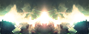
Awesome signature. I like it a lot, but it took a few seconds for me to find the render, focus on it, and figure out what it was.
GruntLeet
Readers Club Posts: 257 Joined: Sun Nov 12, 2006 6:13 pmLocation: Arizona...
Post
by GruntLeet Tue Dec 26, 2006 1:01 am
8/10 Nice because it looks kinda like the halo 1 text o.O and the thing above it i cant find out what it is or you just used a simple texture and if you did 4/10
RaVNzCRoFT
Posts: 6208 Joined: Mon Jan 10, 2005 3:05 pmLocation: Raleigh, North Carolina, USA
Post
by RaVNzCRoFT Tue Dec 26, 2006 5:59 am
What are you talking about??? It doesn't look anything like the Halo font, the thing on top is an electricity stream, and any texture other than that one was too harsh on the eyes.
Your signature gets a 3/10.
Last edited by
RaVNzCRoFT on Tue Dec 26, 2006 7:53 am, edited 1 time in total.
Lt Slap a ho
Posts: 541 Joined: Sat Jun 10, 2006 6:34 pm
Post
by Lt Slap a ho Tue Dec 26, 2006 7:42 am
Why are you going so easy on him ravn?
Kirk
Posts: 6031 Joined: Wed Jan 21, 2004 10:54 pmLocation: Alaska
Post
by Kirk Tue Dec 26, 2006 12:55 pm
You seem to be in a professional mood lately, ho..
noscottno
Posts: 2175 Joined: Thu Aug 10, 2006 7:33 pmLocation: Sacramento, CA
Contact:
Post
by noscottno Tue Dec 26, 2006 1:08 pm
From a Graphics standpoint, it's nice and simple.
Ombre
Posts: 2495 Joined: Sat Dec 11, 2004 12:42 amLocation: California - Bay Area
Post
by Ombre Thu Dec 28, 2006 1:48 am
6/10 Everything about it just looks bad.
Rate:
^Messing around in photoshop.
SHOUTrvb
Posts: 3934 Joined: Sun Feb 13, 2005 11:13 am
Contact:
Post
by SHOUTrvb Thu Dec 28, 2006 8:04 am
Meh, not liking this one. I still think you should use your DJ sig from a few months back. I don't like your new ones too much.
RaVNzCRoFT
Posts: 6208 Joined: Mon Jan 10, 2005 3:05 pmLocation: Raleigh, North Carolina, USA
Post
by RaVNzCRoFT Thu Dec 28, 2006 8:06 am
Simplicity wins.
GruntLeet
Readers Club Posts: 257 Joined: Sun Nov 12, 2006 6:13 pmLocation: Arizona...
Post
by GruntLeet Thu Dec 28, 2006 6:41 pm
Blarg... i still like it...even though you insalted me horribly...\/.\/ 8/10
Sarb
Posts: 1225 Joined: Tue Aug 23, 2005 11:51 amLocation: Canada
Post
by Sarb Thu Dec 28, 2006 6:54 pm
Doesn't look too good, no text just a picture. I don't even like the picture.
3.5/10
I don't even know anymore...


