Wanna show off your Sig/Avatar/artwork. Well this is the place to do it!
G.I.R.
Posts: 3221 Joined: Thu Aug 11, 2005 1:07 pmLocation: Missouri
Contact:
Post
by G.I.R. Sun Oct 01, 2006 2:25 pm
Meh, looks kinda distorted with the brushing
SpecOp44
Posts: 2008 Joined: Tue Jun 06, 2006 12:34 pmLocation: The Canadarm
Post
by SpecOp44 Sun Oct 01, 2006 3:17 pm
Crazy eyes, I like it without knowing why...
Cuda
Posts: 5725 Joined: Tue Oct 18, 2005 2:59 pmLocation: Torrance, CA
Post
by Cuda Tue Oct 03, 2006 5:28 pm
Cropped Screenshot
Sarb
Posts: 1225 Joined: Tue Aug 23, 2005 11:51 amLocation: Canada
Post
by Sarb Tue Oct 03, 2006 6:07 pm
Left side looks good, right side...not so mcuh. 7.9/10.
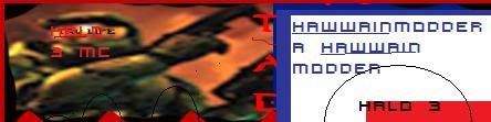
Hawaiian Modder
Posts: 2154 Joined: Sat Nov 26, 2005 7:17 pmLocation: In a cave smokin up with tupac and big foot.
Post
by Hawaiian Modder Wed Oct 04, 2006 11:28 am
Nice.
Thanks lej for the sig.
Dr.Cox wrote: I like Cox.
Sarb
Posts: 1225 Joined: Tue Aug 23, 2005 11:51 amLocation: Canada
Post
by Sarb Wed Oct 04, 2006 11:34 am
The paradise one. I know it's LT's, it's really good, probably his best sig IMO.
TunesRus90
Posts: 335 Joined: Tue Aug 23, 2005 1:27 pm
Post
by TunesRus90 Fri Oct 06, 2006 4:24 pm
I'm not a big fan of the letterbox effect, but otherwise pretty good.
Rate:
noscottno
Posts: 2175 Joined: Thu Aug 10, 2006 7:33 pmLocation: Sacramento, CA
Contact:
Post
by noscottno Fri Oct 06, 2006 4:31 pm
Looks good (I could've sworn seeing a sig like that elsewhere.)
Hawaiian Modder
Posts: 2154 Joined: Sat Nov 26, 2005 7:17 pmLocation: In a cave smokin up with tupac and big foot.
Post
by Hawaiian Modder Fri Oct 06, 2006 6:47 pm
Nice, though the left side looks fucked up.
Thanks lej for the sig.
Dr.Cox wrote: I like Cox.
noscottno
Posts: 2175 Joined: Thu Aug 10, 2006 7:33 pmLocation: Sacramento, CA
Contact:
Post
by noscottno Mon Oct 09, 2006 8:12 pm
I'm not fond up CD4s. 6.92/10
SpecOp44
Posts: 2008 Joined: Tue Jun 06, 2006 12:34 pmLocation: The Canadarm
Post
by SpecOp44 Tue Oct 10, 2006 9:39 am
I'm not sure what it is, colours could be a little better 7/10.
Lt Slap a ho
Posts: 541 Joined: Sat Jun 10, 2006 6:34 pm
Post
by Lt Slap a ho Tue Oct 10, 2006 10:29 am
uh....plain. Come on spec. You've done better >_>
Ketchup_Bomb
Posts: 3374 Joined: Thu Mar 18, 2004 7:52 pmLocation: ¯\ ( º _ o ) /¯
Contact:
Post
by Ketchup_Bomb Tue Oct 10, 2006 8:20 pm
I don't like the light in the background; it seems a bit too bright.
And I also don't like the pixelated text, but it is a lot better than any 'normal' sig.
Pats for the ho. Pats.
Lt Slap a ho
Posts: 541 Joined: Sat Jun 10, 2006 6:34 pm
Post
by Lt Slap a ho Wed Oct 11, 2006 11:39 am
HEY!! im not the ho, i just slap em'
And 9/10 on your sig, not too much, yet not too plain. GJ!
GametagAeonFlux
Posts: 9320 Joined: Sun Jun 06, 2004 7:27 pmLocation: Lincoln, NE
Post
by GametagAeonFlux Wed Oct 11, 2006 11:51 am
10/10
Lt Slap a ho
Posts: 541 Joined: Sat Jun 10, 2006 6:34 pm
Post
by Lt Slap a ho Wed Oct 11, 2006 12:37 pm
GametagAeonFlux wrote: 10/10
lol Thanks man, you made my day!
And the reason im not on my site anymore is cause it was deleted because nobody was joining.


![[x]](http://img255.imageshack.us/img255/3713/fearck7.jpg)
![[x]](http://img246.imageshack.us/img246/8220/rb6vzo3.jpg)
![[x]](http://img504.imageshack.us/img504/7088/bustawolfrb3.jpg)