 copying mutha ****
uhh.. *cough* where was i? o yea
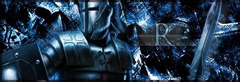
meh it's a nice sig, I don't really like the placement of the R although the text matches the knight. If you haven't seen the whole render, the dude is holding the sword, but in this sig it looks as if it's just floating there. i don't like the blur on the text (the blur's color = teh sux mb?[/mb]), and finally... i truthfully don't like how the entire backround is made of brushing... >_> mb if you threw a stone wall in there.....


