Page 1 of 1
Some signatures from RaZor73
Posted: Thu Apr 17, 2008 2:01 pm
by Aumaan Anubis
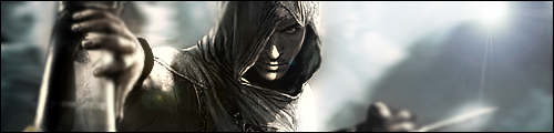
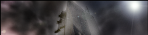
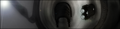
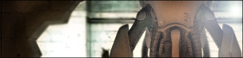
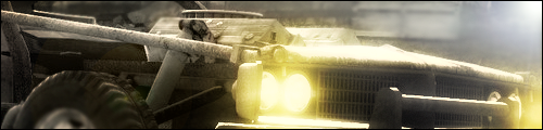
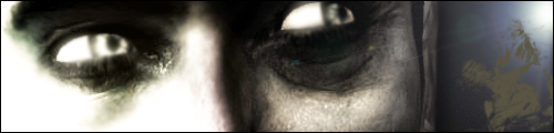
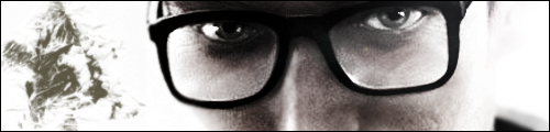
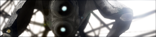
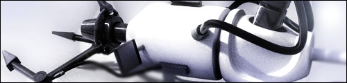
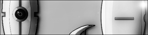
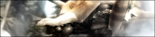
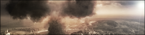
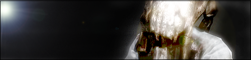
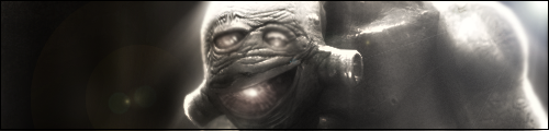
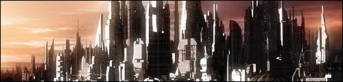
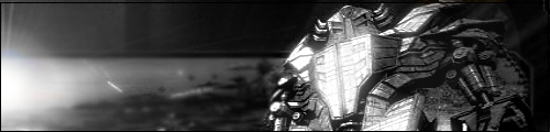
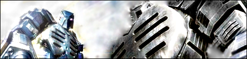
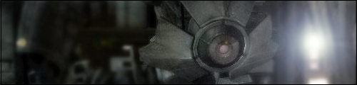
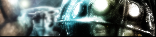
RaZor73 created some signatures, and would like them critiqued. Unfortunately, he's banned from HaloMods, so I posted them for him.
Critique!
Posted: Thu Apr 17, 2008 2:09 pm
by Tural
They're all pretty dull.
Posted: Thu Apr 17, 2008 2:39 pm
by MarsMartianMan
Posted: Thu Apr 17, 2008 6:13 pm
by MoDFox
First one is a weird coincidence...
I agree with what's been said, dull and boring.
Especially with one like Lady Liberty there, way too big for what's in it.
Posted: Fri Apr 18, 2008 3:42 am
by {TP}Spartan
MarsMartianMan wrote:Tural wrote:dull.
....But effective not bad but dull
Posted: Fri Apr 18, 2008 7:30 am
by SHOUTrvb
I rather like the first batch, but there's really nothing special about them. He can't really call them "his" since they're for the most part, just screenshots. Fare shots though.
Posted: Fri Apr 18, 2008 9:03 am
by xXxCocoFangxXx
I'd like one, I need a new sig.
Posted: Fri Apr 18, 2008 9:04 am
by Darkness202
the first couple were fine and simple others were kinda boring and looked like it was just a pasted stock with a few filters put on it and they all were about the same size too try using some different dimensions and a different style with each of them but overall they arent bad
Posted: Fri Apr 18, 2008 9:34 am
by bibbit
Most of them are dull. I like the first one, though.
Posted: Fri Apr 18, 2008 12:38 pm
by Keablr
To me it looks like a bunch of cropped images with some gradients and a few filters. Not really liking it.