Page 1 of 1
Newer Sigs
Posted: Thu Mar 27, 2008 6:52 pm
by super_man916
Well i have 2 more results of non exposed signatures
i need your ideas and comments what i can add or other things
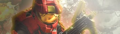
Spartan Cropped:
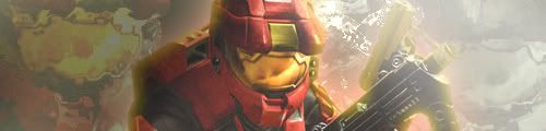
Spartan Uncropped:
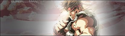
Ryu Cropped:
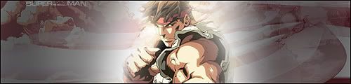
Ryu Uncropped:
Posted: Thu Mar 27, 2008 7:14 pm
by bibbit
I like the Spartan sig, except it needs a border.
Posted: Thu Mar 27, 2008 7:23 pm
by super_man916
i would put a border around it but even a 1 pixel border looks funky so i decided to not put one, mb i should?
Posted: Thu Mar 27, 2008 7:40 pm
by bibbit
I think it would look better, it's your call.
Posted: Thu Mar 27, 2008 7:44 pm
by noscottno
They're low quality, and the glows look terrible.
Posted: Thu Mar 27, 2008 7:44 pm
by super_man916
ill stick with none for now but i might have a change
how exactly would i get higher quality and do you think you could say how i could make my sig better?
Posted: Thu Mar 27, 2008 7:57 pm
by Aumaan Anubis
IMO.
Increase color saturation.
Sharpen it a little bit.
Using those methods, this is what I got...

I dunno, I just like brighter colors in a signature. So, to me, it looks better this way.
Posted: Thu Mar 27, 2008 8:00 pm
by super_man916
thanks ill try it but i thought i sharpened it more than i actualy did
Posted: Thu Mar 27, 2008 9:19 pm
by DEEhunter
get rid of the inner glow on the spartan.
Posted: Fri Mar 28, 2008 3:54 pm
by DRL333
Brighten the backgrounds and add a border to the spartan sigs and I'll like 'em.
Posted: Fri Mar 28, 2008 5:38 pm
by super_man916
ok thank you all for your input