Page 1 of 3
Marathon Spartan(2nd Vector)
Posted: Sun Jan 13, 2008 10:03 am
by CabooseJr
I just completed my 2nd vector, this time I chose to take a picture of my player and vector him. I think the outcome came out pretty nice.
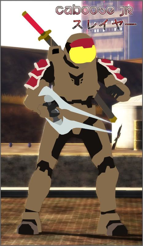
C&C is appreciated.
"Working on V2 with more detail and shading."
V2
Posted: Sun Jan 13, 2008 10:05 am
by Tural
Lacks any depth. A vector is more than just filling areas with color.
Posted: Sun Jan 13, 2008 10:16 am
by CabooseJr
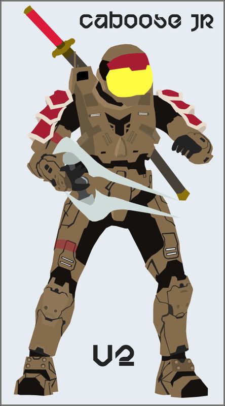
I'm working on a V2 right now.
Posted: Sun Jan 13, 2008 10:32 am
by JK-47
Needs more detail. And you should work on shading via gradients and such, or burn/dodge tool. But you got the basic shape down.
Posted: Sun Jan 13, 2008 10:44 am
by Cobain
sry, i rly dnt lk it
Posted: Sun Jan 13, 2008 10:50 am
by CabooseJr
If you're going to C&C, use Proper English.
Posted: Sun Jan 13, 2008 10:50 am
by HPDarkness
You have a nice basic outline. I'd like to see it with more detail and maybe some shading. It looks like a cardboard cutout.
Posted: Sun Jan 13, 2008 11:15 am
by halobuddha
looks good so far cant wait to see v2
Posted: Sun Jan 13, 2008 11:21 am
by -DeToX-
Wayyy too basic. You should've spent more time on this before releasing it. I would say your V2 as you describe it, shouldve been your V1.
Posted: Sun Jan 13, 2008 11:32 am
by benman08
CabooseJr wrote:If you're going to C&C, use Proper English.
Who are you? His mom?
Posted: Sun Jan 13, 2008 11:34 am
by Philly
benman08 wrote:CabooseJr wrote:If you're going to C&C, use Proper English.
Who are you? His mom?
Metaphorically speaking, yes.
Posted: Sun Jan 13, 2008 11:38 am
by halobuddha
lol can i be the daddy?
Posted: Sun Jan 13, 2008 11:46 am
by SHOUTrvb
I highly recommend that you decide against using gradients for shading. Proper lighting for most vector work is best achieved by using straight color. As a matter of fact, the definition of a vector is a shape that can be sized to any resolution without losing quality. Gradients make that difficult to achieve. The path you took with the Shoulder Pads was the right direction to go for lighting. The pads actually look really nice. Now just apply to concept to the rest of the image.
Posted: Sun Jan 13, 2008 5:00 pm
by {TP}Spartan
why does the spartan have a glow?
Posted: Sun Jan 13, 2008 5:17 pm
by Xiion
fingers are messed up.
Posted: Sun Jan 13, 2008 5:43 pm
by ScottyGEE
Gradients are for noobs...Only use them sparingly

But yes whilst kool, definatly needs the shading and depth work...
Posted: Sun Jan 13, 2008 6:06 pm
by kibito87
While I do like your spartan laser more than this work. I am intrigued by this style now. Keep at it and hopefully we'll see some fantastic work from you!
Posted: Sun Jan 13, 2008 6:13 pm
by CabooseJr
Here is a little update(It's not finished yet so bear with me)
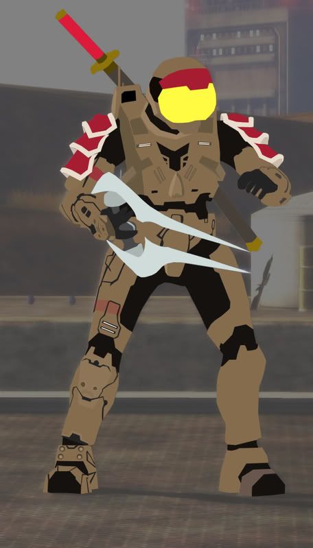
I will post a finished one tomorrow on the first post.
Posted: Sun Jan 13, 2008 6:35 pm
by xlRainlx
nice, i like it.

Posted: Sun Jan 13, 2008 6:51 pm
by Dr.Cox
Much bettah. Fix those fingars.