

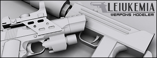
Critique and advice would be appreciated


|
|
|
|
|
I disagree. The text on the first one is the best aside from the micro JK-47, but it's not great. If you're willing to sacrifice the main text, I'd just must the JK-47 to the top right and call it a sig. As for the sig itself, I really like it. I've seen those wings in a tutorial before, but I can safely say that yours look considerably better, and fit well with the bullet. Very nice job.kornkidcrazy wrote:An idea for text is try to make the text look engraved on the shell of the bullet. That'd be kind of neat maybe..

|
|

Dr.Cox wrote:gh0570fchurch has a mexi-stash. =D
I didgh0570fchurch wrote:Not your best, but I like it. Took the song title literally, but that's not always bad.
Off-topic: Mellon Collie and the Infinite Sadness is definitely Smashing Pumpkins' best album (that's the one the song is from, if you didn't know).
|
|
Dr.Cox wrote:gh0570fchurch has a mexi-stash. =D


