Page 1 of 2
Destiny
Posted: Mon Nov 05, 2007 3:31 pm
by JK-47
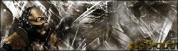
I was just messin around in photoshop with a picture of a combine and some other things, and came up with this:

What do you think...?
Posted: Mon Nov 05, 2007 3:34 pm
by GametagAeonFlux
Too busy, no real flow to it either...
Posted: Mon Nov 05, 2007 3:35 pm
by gh0570fchurch
Turn down the contrast and work on the colors a bit, and you've got yourself a pretty good brush sig. A more significant focal point would be nice, too.
Posted: Mon Nov 05, 2007 4:03 pm
by {TP}Spartan
it looks a little too busy on the left side need more on the right
Posted: Mon Nov 05, 2007 4:21 pm
by CabooseJr
It looks like you followed Titusz's tutorial.
could use a different font or something.
Posted: Mon Nov 05, 2007 4:38 pm
by JK-47
I'll try to make it a bit more simple, and work on a more solid color, and I didn't use brushes, or a tutorial :p
Posted: Mon Nov 05, 2007 4:42 pm
by gh0570fchurch
Hmm, looks a lot like brushes. I still stand by what I said, just except for the brushes bit. Reminds me of a sig I made a long time ago:
Ugh.

Posted: Mon Nov 05, 2007 4:47 pm
by Kirk
Colors are a bit weird.
Posted: Mon Nov 05, 2007 4:50 pm
by JK-47
gh0570fchurch wrote:Hmm, looks a lot like brushes. I still stand by what I said, just except for the brushes bit. Reminds me of a sig I made a long time ago:
Ugh.
They're renders I made :p
Here's a newer version:

Posted: Mon Nov 05, 2007 4:53 pm
by CabooseJr
That looks much better.
Posted: Mon Nov 05, 2007 4:57 pm
by gh0570fchurch
Ooh, much better. Maybe a little more of a focal point on the render. Maybe blur the background slightly (very) and sharpen the render about the same amount. The render might be better off to the left a bit instead of in the center as well.
Posted: Mon Nov 05, 2007 5:46 pm
by JK-47
I can't move the combine without messing up the sig, but I blurred the background to add a focus to the combine a little:

Posted: Mon Nov 05, 2007 5:47 pm
by gh0570fchurch
Hmm, it's better than it was before. I rather like it.

Posted: Mon Nov 05, 2007 6:15 pm
by Dsoup
The pink on his forehead is gross, but other than that it's pretty good.
Posted: Tue Nov 06, 2007 4:23 am
by Titusz
A couple of adjustment layers and it'll look awesome

Posted: Tue Nov 06, 2007 6:28 am
by SHOUTrvb
Why would he add adjustment layers?
I think the text sticks out a little too much, but I really like the sig. It's pretty fantastic.
Posted: Tue Nov 06, 2007 9:31 am
by Titusz
To get the ugly pink out.
Posted: Tue Nov 06, 2007 6:58 pm
by JK-47
I'll try to get the pink out, even though I don't see the problem :p
I'll fix the text as well.
Posted: Tue Nov 06, 2007 8:19 pm
by SHOUTrvb
The pink adds to it. I'm not seeing what Titusz sees apparently. The current has a ton of depth, which is great. Other than fixing the text, I'd say you're done and should current.
Posted: Tue Nov 06, 2007 8:30 pm
by JK-47
Like dis?
