Page 1 of 2
Style critique
Posted: Tue Oct 02, 2007 5:25 am
by ScottyGEE
Well, I've been noting Danke's critisism of my drawings about gradients and their overuse(or overkill?) and was trying to think of alternatives.
I found gradients to add the extra detail to the drawings without necessarily going to the effort of adding extra detail...However, now I realise the way I've done it makes no real sense whatsoever. I was wondering exactly how I should go about making changes.
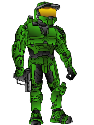
I decided to remove all gradients (except the visor) as a test to see what things look like without it...
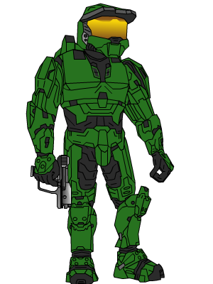
So now I'm at a loose end, I'd also like to get this done and continue the adventures thread (which I've been delaying, however I will get back to it...I've been busy and I also didn't plan what was gonig to happen next, which I'll have to figure out too...But enough of this bracket talk)
So how exactly could I make these drawings better? I'd also like some sort of link to "how" said technique can be done...However that's not a requirement.
Posted: Tue Oct 02, 2007 7:55 am
by theycallmechad
ScottageGeese, I think you shouldn't do anything other than the original. Not only does it look better than the "anti-gradient" version by adding a level of depth to your characters, it's totally your style. It's not a ScottyGEE drawing, in my opinion, without it.
Posted: Tue Oct 02, 2007 9:04 am
by Modtrocity
Definately the gradient one.
Posted: Tue Oct 02, 2007 2:13 pm
by youhoo7
no gradiant looks flat
Posted: Tue Oct 02, 2007 6:26 pm
by Sarb
I think you should do a semi-gradient, the gradient looks good, but I see where Danke's comming from.
I think best thing to do is experiment different coloring methods, this has a lot of potential, if nothng works out thats fine.
Just stcik at it and try different coloring and shading.
I'm not too good with this stuff, so that's as deep I can go.
Posted: Tue Oct 02, 2007 6:28 pm
by JacksonCougAr
just add shadows instead of faking them with gradients :p
Posted: Tue Oct 02, 2007 6:49 pm
by Dsoup
I think that the non-gradient one looks more realistic.
However:
It doesn't have the authentic ScottyGee look, and looks a little more boring. Overall, I'd go for the gradients.
Posted: Tue Oct 02, 2007 7:51 pm
by ScottyGEE
Just to clarify, this isn't so much about whether I should go with gradients or not, it is more about how I can take the drawings further. By using actual drawing techniques rather than gradients.
So the one without the gradient is not really a final, but more of a "what the heck can I do with it to make it look good without having to resort to gradients for the whole thing"
Regardless I appreciate what has been said so far.
Posted: Tue Oct 02, 2007 8:06 pm
by Guest
in the drawings itself detail is everything add lots of detail but if you think the detail is bad it most likely is. I also prefer the gradient one it stands out more, more of a 3d feel as the non gradient one is flat.
Posted: Tue Oct 02, 2007 8:14 pm
by JacksonCougAr
Warning! Following Contains GRAPHIC examples....
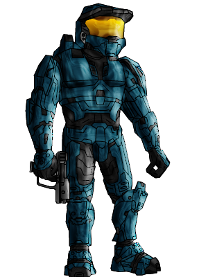
Oh Noes! Shadows and odd looking reflections/lighting...
Posted: Tue Oct 02, 2007 8:43 pm
by Dr.Cox
Wow!
I like that one!
Posted: Tue Oct 02, 2007 9:34 pm
by Kirk
JacksonCougAr wrote:Oh Noes! Shadows and odd looking reflections/lighting...
That don't follow the contours of the body at all

As much as I think gradients aren't really great, they are definitely better than nothing at all in this case.
Posted: Wed Oct 03, 2007 6:02 am
by jim20af
i still like the one w/ the gradiant, b/c it shows some detail but in a "cartooney" kind of way, which is what feels like these drawings are to be. the one w/ none is too boring and the other is trying to be too detailed in a drawing which really seems like it shouldn't be.
Posted: Wed Oct 03, 2007 6:21 am
by phoenix
Hmm , jackson i like that:)and btw what program do you use to make it?
Re: Style critique
Posted: Wed Oct 03, 2007 9:22 am
by INSANEdrive
Evolution MbMb
Posted: Wed Oct 03, 2007 11:44 am
by CabooseJr
He looks flat.
Posted: Wed Oct 03, 2007 11:57 am
by Sgt.Peppers
It's a little flash cartoon, I don't think it needs to have so much realism and detail.

Posted: Wed Oct 03, 2007 1:10 pm
by JacksonCougAr
I have to agree with certain peoples. My version is too busy, too strong, and doesn't follow contours right.
Posted: Wed Oct 03, 2007 2:26 pm
by youhoo7
i think there is no need for an other tecnique, it looks great altogether..and its what we all know you 4
Posted: Thu Oct 04, 2007 3:40 pm
by SHOUTrvb
Still...Jackson might be on to something. Though it defies the point of Scotty's drawings, it has a lot of something to it. I can't put my finger on it, but I think that might work if it were refined. Also, I never really minded the poor gradient use.