Page 1 of 1
My First Halo 3 sig
Posted: Wed Sep 19, 2007 8:28 pm
by theycallmechad
No, I did NOT use the Normal Map filter.
Yes, it is Halo 3 related.

Posted: Wed Sep 19, 2007 8:38 pm
by JacksonCougAr
Errrrm, it's a start, but it needs more unfortunately...
Posted: Wed Sep 19, 2007 8:43 pm
by theycallmechad
Nah, I considered it and even began adding more, but it took away from it's H3-ishness. My sigs are always and have always been different from almost every sig ever posted here. What you see is my style, not my lack of content.
Thanks anyway, though. I have this where I want it. I'm not knocking your suggestion.
Posted: Wed Sep 19, 2007 8:51 pm
by V0Lt4Ge
What's goin' on on the top left?
Posted: Wed Sep 19, 2007 8:55 pm
by JacksonCougAr
Yea, it's definitely a style. I really can't seem to like it though because its just too... bland I think... I don't really like the colours either but thats a personal choice there. I hate rounded corners too :p They fail in my opinion. I also don't really like how you have the inner shadow? around the outside. Does look a bit like clay though :p
Can I edit it to my likening and post it here by chance?
Posted: Wed Sep 19, 2007 8:59 pm
by Ragdoll
haha, I thought it said "tomg" up in the corner. you got me all excited

but, it has its own unique style, i really cannot see anything "wrong" in it.
Posted: Wed Sep 19, 2007 9:02 pm
by JacksonCougAr
Theres never anything 'wrong' with computer graphics... or any form of art per say, but I really can't seem to find an attachment to it :

Posted: Wed Sep 19, 2007 9:05 pm
by Ragdoll
i know, i was making a general statement about graphics, didnt mean to aim it at you at all.
Posted: Wed Sep 19, 2007 9:06 pm
by theycallmechad
Haha! I'm loving how much this thing is bugging you. You can do with it as you please. I have several other ideas and things I plan on doing with this. This is just the first of many (if I get the motivation to do them). The others don't look at all like this, although they did all come from the exact same source.
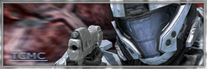
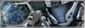
The top left was a big blank area. I made this sig directly from a Halo 3 picture, so I didn't create the top left area; I did, however, add "TCMC" in it to fill in the space.
Jackson, I have a version that doesn't have rounded edges. I really really didn't like it, so I rounded them off.
Also, sometimes I create things just to make people think beyond calm asthetics. When I create my pictures, I usually go for 1 of 3 things: To tell a story of sorts, to make people feel relaxed and happy, or to give conflicting feelings to people who view it. At least with conflicting feelings, you are looking at and contemplating my work

. Thanks!
Posted: Wed Sep 19, 2007 9:12 pm
by Ragdoll
theycallmechad wrote:The top left was a big blank area. I made this sig directly from a Halo 3 picture, so I didn't create the top left area; I did, however, add "TCMC" in it to fill in the space.
I still think it says tomg :p
Posted: Wed Sep 19, 2007 9:14 pm
by theycallmechad
It's yours if you want it. It does look a lot like TOMG...
Posted: Wed Sep 19, 2007 9:19 pm
by Ragdoll
theycallmechad wrote:It's yours if you want it. It does look a lot like TOMG...
werd? thanks man, i'll probably use in a week or so.
Posted: Wed Sep 19, 2007 9:26 pm
by destroyer69
It's interesting, to say the least.
Posted: Wed Sep 19, 2007 9:31 pm
by theycallmechad
destroyer69 wrote:It's interesting, to say the least.
Yeah, that's about how I feel about it too...
Oh, and in case anybody cares, here's the original:
http://www.halo3impact.com/wallpapers/i ... per-01.jpg
Posted: Wed Sep 19, 2007 10:03 pm
by JacksonCougAr
This is what I did, I like it alright but the background needs a little work. The colours are wrong :p
I Dunno -_- Theres just something...missing :p
What do you think Chad?
Posted: Wed Sep 19, 2007 10:19 pm
by Dsoup
I don't like the original or the update by Cougar, the original is just confusing and it hurts my eyes.
Posted: Wed Sep 19, 2007 10:40 pm
by Kirk
Still the best sigs I've seen in awhile, from Cougar.
Posted: Thu Sep 20, 2007 5:10 am
by theycallmechad
Cougar, they look great. I like the blue/blue one most of the two; however, I still just see a character render with a background (at least there's no grundge brushing or things of this nature). I'm just not into those kind of sigs. They all start to look the same to me after a while.
Posted: Thu Sep 20, 2007 7:26 am
by SHOUTrvb
I don't like the image, but it has a lot of depth, which is hard to get. Plus it does have a touch of mystery to it, and that I like. I'll give it a (neat - -neat) = (neat) = Neat.