CQB Armor with Pistol Final Version

Wanna show off your Sig/Avatar/artwork. Well this is the place to do it!
Post Reply
User avatar
killarzachary


Coagulator Recreator Snitch!

Posts: 934
Joined: Sat Mar 03, 2007 9:26 am
Location: High School
Contact:

CQB Armor with Pistol Final Version

Post by killarzachary »

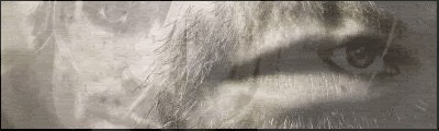
What do you guys think? I thought this looked real good, but sadly I couldn't get any good looking text for it, if you think you could help then please contact me on AIM.

Image
Image
User avatar
SHOUTrvb


Socialist Snitch! Advisor Orb
Mad Hatter Connoisseur Pyre

Posts: 3934
Joined: Sun Feb 13, 2005 11:13 am
Contact:

Post by SHOUTrvb »

An interesting effect on the left, but I don't really like the sig as a whole. Lighting is off and nothing really blends together, and you've almost made the left effect the focal point rather than the MC.
User avatar
killarzachary


Coagulator Recreator Snitch!

Posts: 934
Joined: Sat Mar 03, 2007 9:26 am
Location: High School
Contact:

Post by killarzachary »

SHOUTrvb wrote:An interesting effect on the left, but I don't really like the sig as a whole. Lighting is off and nothing really blends together, and you've almost made the left effect the focal point rather than the MC.
I see what you mean, i'm going to be trying to make the lighting what it used to be.
Image
User avatar
Sgt.Peppers


Snitch! Connoisseur

Posts: 2277
Joined: Thu Jul 06, 2006 1:25 pm
Location: Texas

Post by Sgt.Peppers »

The cutout of the pistol looks poorly done, other than that, I think it rocks. Good job.
Angel-Natavi


Posts: 40
Joined: Tue Sep 18, 2007 11:35 am
Location: In the land of the free, because of the brave.

Post by Angel-Natavi »

Personally, I like it. Makes it look more like a scenematic than a still shot.

And, parden the butchering of this phrase, but I think it would go well with your sig.

"And when he gets to heaven, to Saint Peter, he shall tell: 'Another soldier reporting sir. I've served my time in hell.'"
User avatar
Modtrocity


Posts: 275
Joined: Sat Aug 04, 2007 4:20 pm
Location: Springfield, VA

Post by Modtrocity »

I agree with Angel. I think it looks good. All you need to do is add a border. Even if it's a simple one pixel stroke, it'd look better then nothing.
Image
User avatar
killarzachary


Coagulator Recreator Snitch!

Posts: 934
Joined: Sat Mar 03, 2007 9:26 am
Location: High School
Contact:

Post by killarzachary »

Modtrocity wrote:I agree with Angel. I think it looks good. All you need to do is add a border. Even if it's a simple one pixel stroke, it'd look better then nothing.
Lol, I could of sworn I put in a border, I'll fix that soon, also try to get text.
Image
User avatar
Modtrocity


Posts: 275
Joined: Sat Aug 04, 2007 4:20 pm
Location: Springfield, VA

Post by Modtrocity »

Try a 2-3 pixel border set to overlay.
Image
User avatar
Halo4Ever


Connoisseur Wordewatician 250

Posts: 447
Joined: Tue Jul 18, 2006 6:08 am
Location: Newyork XBLGTag: Br4nd3n

Post by Halo4Ever »

I like it alot, It makes it look like hes shooting, Like the wind is parting for a bullet, Get some text! :wink:
Image
"A hero needs not to speak, for when he is gone, the world will speak for him" - My favorite quote.
User avatar
killarzachary


Coagulator Recreator Snitch!

Posts: 934
Joined: Sat Mar 03, 2007 9:26 am
Location: High School
Contact:

Post by killarzachary »

Halo4Ever wrote:I like it alot, It makes it look like hes shooting, Like the wind is parting for a bullet, Get some text! :wink:
But every time I try to add text it looks like shit.
Image
User avatar
Modtrocity


Posts: 275
Joined: Sat Aug 04, 2007 4:20 pm
Location: Springfield, VA

Post by Modtrocity »

All I'd try to do is get that light spot out of there. If it was a Lens Flare, try putting it behind the Chief's head.
Last edited by Modtrocity on Thu Sep 20, 2007 9:37 am, edited 1 time in total.
Image
User avatar
youhoo7


Posts: 1021
Joined: Fri Oct 27, 2006 2:53 pm

Post by youhoo7 »

i think for text you should place just a simple arial, in the botom left corner, or just make it a textless sig
Image
We
Kirk


Socialist Snitch! Mad Hatter

Posts: 6031
Joined: Wed Jan 21, 2004 10:54 pm
Location: Alaska

Post by Kirk »

Modtrocity wrote:Image

How's something like that?

All I'd try to do is get that light spot out of there. If it was a Lens Flare, try putting it behind the Chief's head.
Yeah that doesn't look good.
Image
User avatar
Modtrocity


Posts: 275
Joined: Sat Aug 04, 2007 4:20 pm
Location: Springfield, VA

Post by Modtrocity »

>_> I did it in like five seconds... Yeah the text does look bad..
Image
Angel-Natavi


Posts: 40
Joined: Tue Sep 18, 2007 11:35 am
Location: In the land of the free, because of the brave.

Post by Angel-Natavi »

Well, of course it doesn't look good. You need something that compliments the primary colors of the signature, which are dark red and gold. I would put the text down in the black bar in the lower left of the image, with a golden-ish outline similar to the helm on the spartan. Use that as your text, with whatever effect you want, with a dark red or something similar on the inside. That way, it is easily recognizable, and readable.
Post Reply