Page 1 of 1
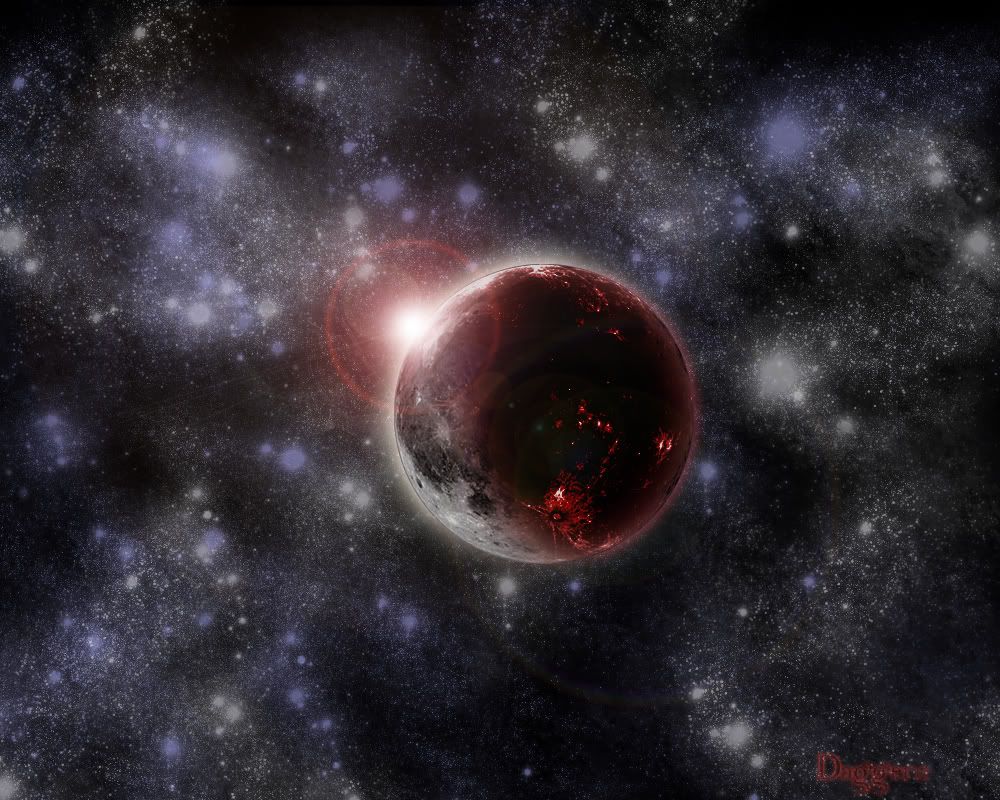
Bloody Moon i used a TUT
Posted: Sun Sep 09, 2007 1:48 pm
by Dagger13
well here it is plz rate x/10
Posted: Sun Sep 09, 2007 1:55 pm
by D4rkFire
I like it a lot, good job
8/10.
Posted: Sun Sep 09, 2007 2:33 pm
by JK-47
The background seems dull, and there's too many brighter stars. And there seems to be a hard line around the planet (you can see it where the sun shines on it the most). And, the change from the normal moon to the bloody part of it seems a little abrupt. You should try to make it a little more gradual. Also, in the top left hand corner of the image, I can see clearly that you clone brushed it by the repeditive-ness of the star cluster. Try to hide that a little bit.
Other than that, it's good.
7/10
Posted: Sun Sep 09, 2007 3:06 pm
by Dsoup
The glowing around the moon makes it look just plastered on there. It looks bad, and considering you even used a tut, 3/10.
Posted: Sun Sep 09, 2007 5:16 pm
by reanimation-06
looks nice, but I agree with all the above coments.. and can u link me to the tut? i would be thankful!
Posted: Mon Sep 10, 2007 10:12 am
by Alexei
well
for a TUT image its more than passable
but u have to remember that starts are distant suns, here they look brushed on. they dont have solid white in the middle like a star would.
and its abit overkill with the stars too imho. lower the number, increase the brightness. and maybe decrease the size some and itll be much better

Posted: Tue Sep 11, 2007 10:58 am
by HK-47
I like the Lighting sort of, but theres too many visible errors on its Rim

.
Posted: Tue Sep 11, 2007 2:43 pm
by Dagger13
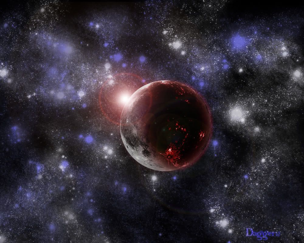
thx guys do u think this is better?
Posted: Tue Sep 11, 2007 2:45 pm
by GametagAeonFlux
The lens flare and the stars in general are just disgusting.
Posted: Tue Sep 11, 2007 3:06 pm
by Rockymods
I thought it looked cool... After looking at it closer I still like the planet but the stars truly need to be changed.
Posted: Tue Sep 11, 2007 6:52 pm
by Guest
reminds me of technology, looks kick ass none the less.
Posted: Tue Sep 11, 2007 6:56 pm
by Dsoup
I don't like either of them, the stars are still just paint splotches that have nothing to do with the red planet and the lens flare.
Posted: Tue Sep 11, 2007 7:00 pm
by SHOUTrvb
Planet looks good. You're moving along well being that this was one your first.