Wanna show off your Sig/Avatar/artwork. Well this is the place to do it!
Th2mods
Readers Club Posts: 1229 Joined: Mon Jan 08, 2007 5:54 pmLocation: Salt Lake City, Utah
Contact:
Post
by Th2mods Mon Aug 27, 2007 9:17 pm
this is my log for my gears of war site, what do you think?
Last edited by
Th2mods on Mon Aug 27, 2007 9:37 pm, edited 2 times in total.
Xiion
Posts: 2230 Joined: Sat Jul 09, 2005 11:22 amLocation: Uhhh Uhm uhhh... NO WHEREZ!!
Contact:
Post
by Xiion Mon Aug 27, 2007 9:34 pm
there's nothing there?
Th2mods
Readers Club Posts: 1229 Joined: Mon Jan 08, 2007 5:54 pmLocation: Salt Lake City, Utah
Contact:
Post
by Th2mods Mon Aug 27, 2007 9:38 pm
ahh sry, wouldn't display the one hosted on my server. There its now up
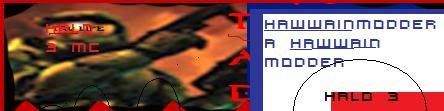
Hawaiian Modder
Posts: 2154 Joined: Sat Nov 26, 2005 7:17 pmLocation: In a cave smokin up with tupac and big foot.
Post
by Hawaiian Modder Tue Aug 28, 2007 9:58 am
The Marcus render looks way to low quality, Besides that I like the concept, nice execution.
Good Job.
Thanks lej for the sig.
Dr.Cox wrote: I like Cox.
Th2mods
Readers Club Posts: 1229 Joined: Mon Jan 08, 2007 5:54 pmLocation: Salt Lake City, Utah
Contact:
Post
by Th2mods Tue Aug 28, 2007 11:29 am
Hawaiian Modder wrote: The Marcus render looks way to low quality, Besides that I like the concept, nice execution.
Good Job.
its the blur on the image as i got it, its a HD pic from the gears site, and it has blur.
Hawaiian Modder
Posts: 2154 Joined: Sat Nov 26, 2005 7:17 pmLocation: In a cave smokin up with tupac and big foot.
Post
by Hawaiian Modder Tue Aug 28, 2007 12:17 pm
Well it looks out of place, the Locust render isn't blurred, but marcus is?
Thanks lej for the sig.
Dr.Cox wrote: I like Cox.
Th2mods
Readers Club Posts: 1229 Joined: Mon Jan 08, 2007 5:54 pmLocation: Salt Lake City, Utah
Contact:
Post
by Th2mods Tue Aug 28, 2007 12:48 pm
Hawaiian Modder wrote: Well it looks out of place, the Locust render isn't blurred, but marcus is?
my reason is they are 2 separate pictures...
SHOUTrvb
Posts: 3934 Joined: Sun Feb 13, 2005 11:13 am
Contact:
Post
by SHOUTrvb Tue Aug 28, 2007 1:34 pm
The image quality on both side is a tad poor. You can also feel free to go all out when making site banners. Gears of War calls for bloody chaos, so feel free to give it some more gore.
This is a good start though. Keep it up.
JacksonCougAr
Posts: 2333 Joined: Fri Jan 12, 2007 1:56 pmLocation: Canada
Contact:
Post
by JacksonCougAr Tue Aug 28, 2007 2:39 pm
Yea I was going to say it looks to clean >_> add some grunge to it, mash it up, blend it together, ad more hilights, but keep in mind you want you text to by very noticable...
Th2mods
Readers Club Posts: 1229 Joined: Mon Jan 08, 2007 5:54 pmLocation: Salt Lake City, Utah
Contact:
Post
by Th2mods Tue Aug 28, 2007 3:43 pm
meh, im horrible when it comes to making something look good for a site
Sgt.Peppers
Posts: 2277 Joined: Thu Jul 06, 2006 1:25 pmLocation: Texas
Post
by Sgt.Peppers Tue Aug 28, 2007 3:48 pm
Blur the right edge of the render on the left, it looks really choppy.
It doesn't look
terrible but it doesn't look too fantastic. It is good, however.
Th2mods
Readers Club Posts: 1229 Joined: Mon Jan 08, 2007 5:54 pmLocation: Salt Lake City, Utah
Contact:
Post
by Th2mods Tue Aug 28, 2007 4:12 pm
Sgt.Peppers wrote: Blur the right edge of the render on the left, it looks really choppy.
It doesn't look
terrible but it doesn't look too fantastic. It is good, however.
you mean the cutout is choppy?
Kirk
Posts: 6031 Joined: Wed Jan 21, 2004 10:54 pmLocation: Alaska
Post
by Kirk Tue Aug 28, 2007 4:45 pm
Th2mods wrote: Hawaiian Modder wrote: Well it looks out of place, the Locust render isn't blurred, but marcus is?
my reason is they are 2 separate pictures...
So find a better one. It's not like there aren't more out there
It's okay, but a bit lacking. Try adding stuff in where the black is, as others have mentioned.


