Page 1 of 1
Sacred;onelastbreath
Posted: Sat Aug 25, 2007 6:31 pm
by dragon248
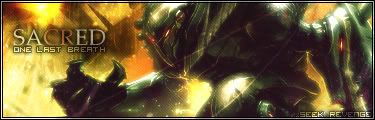
[text is bad to me.. the rest is
okay to me. its just different i guess]
Posted: Sat Aug 25, 2007 6:34 pm
by Sgt.Peppers
I like it alot.
Posted: Sat Aug 25, 2007 8:53 pm
by Dsoup
I don't like the smaller text, but the rest is really cool.
Posted: Sat Aug 25, 2007 9:00 pm
by SHOUTrvb
I like the oldschool text style. Nice lookin sig.
Posted: Sat Aug 25, 2007 9:11 pm
by dragon248
thanks guys
Posted: Sat Aug 25, 2007 10:06 pm
by gh0570fchurch
Maybe you should overlay some of the background color to the render, that would help it blend a bit better.
Posted: Sat Aug 25, 2007 10:10 pm
by Tural
Excellent.
Posted: Sat Aug 25, 2007 10:31 pm
by Dr.Cox
gh0570fchurch wrote:Maybe you should overlay some of the background color to the render, that would help it blend a bit better.
No...
I love how it looks like hes emerging from the pitts of hell. i think this is pretty awesome

besides some text issues
Posted: Sat Aug 25, 2007 10:33 pm
by gh0570fchurch
Armed Civilian wrote:gh0570fchurch wrote:Maybe you should overlay some of the background color to the render, that would help it blend a bit better.
No...
I love how it looks like hes emerging from the pitts of hell. i think this is pretty awesome
besides some text issues
It just seems like the render color contrasts too much with the background. Cool colors against a warm color background in that fashion = :/ to me.
Overall, I still like it, it's just that one thing. Art can never be perfect.
Posted: Sat Aug 25, 2007 10:37 pm
by Dsoup
I agree with JK-47, it looks like his left arm is way too greenish compared to the firey pits of hell.