Page 1 of 1
Street Chief
Posted: Sat Jul 14, 2007 10:44 am
by CrackWombat
A little wallpaper i did today
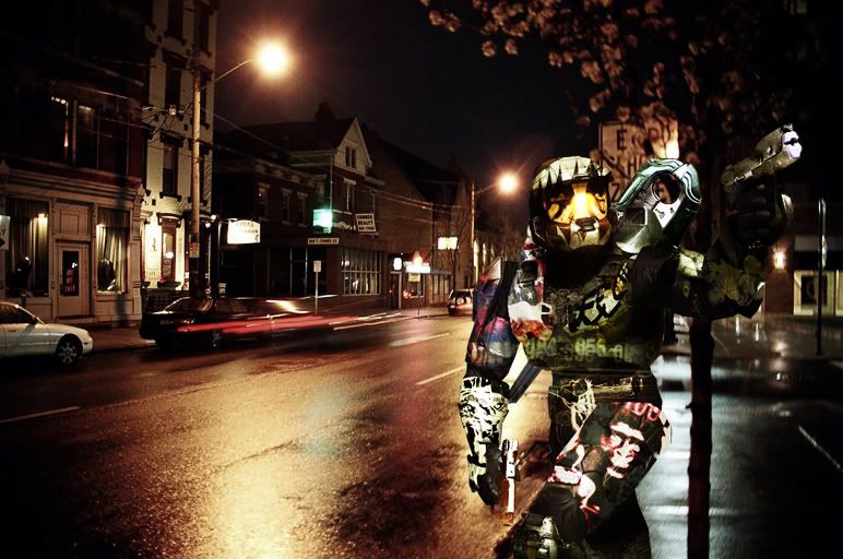
I think ill put a brute behind one of the cars in the background stalking MC, but later.
Full Res Chief:

Shot at 2007-07-15
MERGE:New sig.... please
any crit would be appreciated! ( seeing as how my last thread was locked ill be less responsive and/or defensive lol)
*** Just reposted, sig was over 75k sorry!
Seeing how they are the same image with different sizes and text, Might as well combine the two.
yup... seems logical thx
Posted: Sat Jul 14, 2007 11:08 am
by FReAK
I like the chief, and I like the background. But they could be blended a little better. Also, where did you get your render from? I've never seen that one before, and i've looked through most of the H3 screenshots released to date.
Posted: Sat Jul 14, 2007 11:15 am
by CrackWombat
FReAK wrote:I like the chief, and I like the background. But they could be blended a little better. Also, where did you get your render from? I've never seen that one before, and i've looked through most of the H3 screenshots released to date.
Yes you are right I'll do that....
I got it from Gamespot.

Posted: Sat Jul 14, 2007 11:25 am
by JK-47
Like freak said, they could be blended better.
On another subject... I REALLY like your sig. Like, a LOT.
Posted: Sat Jul 14, 2007 11:52 am
by CrackWombat
JK-47 wrote:Like freak said, they could be blended better.
On another subject... I REALLY like your sig. Like, a LOT.
I like your avatar... it's funny hahaha.

Posted: Sun Jul 15, 2007 12:40 am
by Cuda
Lighting on the chief could be better, and toning down the designs on the chief would really make it more distinguishable.
Posted: Sun Jul 15, 2007 8:42 am
by Phosphorous
Why are there designs all over him? I think it might look better without them...
Posted: Sun Jul 15, 2007 9:00 am
by CrackWombat
Cuda wrote:Lighting on the chief could be better, and toning down the designs on the chief would really make it more distinguishable.
Yup but unfortunately I merged all my layers (which was stupid) I and can't adjust any blending or transparency.

Posted: Sun Jul 15, 2007 6:15 pm
by Dr.Cox
Phosphorous wrote:Why are there designs all over him? I think it might look better without them...
It just looks bad in my opinion. All this work on the MC (which looks terrible