Page 1 of 2
New sig
Posted: Wed Jun 13, 2007 8:31 pm
by youhoo7
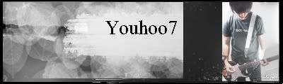
ok so its been my current for about 5 days...but i lost my posting for that time so this string was delayd...anyways here is my first photoshop sig ever...and it is also my first with a photoshoot of me....so give me critical advice...and props...and wat ever...and please every post include a _/10 grade

EDIT: sorry i meant to include these

Posted: Wed Jun 13, 2007 9:27 pm
by JK-47
The one you have currented is the best. You've gotten better, I like your new sig

Posted: Thu Jun 14, 2007 1:37 am
by Cuda
Text is downright bad, and render looks tacked on.
Posted: Thu Jun 14, 2007 7:08 am
by youhoo7
well,i dont think im going to change the text....i have it that way just because i just like it how it is....but thanks for the criticism
Posted: Thu Jun 14, 2007 7:13 am
by Sgt.Peppers
Your current is the best, yes the text could use work, but you're definitly improving youhoo.
Posted: Thu Jun 14, 2007 7:15 am
by youhoo7
thanks...that meens alot coming from you peppers...but can you guys please leave me a _/10 score
Posted: Thu Jun 14, 2007 7:33 am
by Trulife8342
Lol thats creative use of the leaf brush, your getting better, I also like the text some what, just set its blending option to overlay or lower the opacity just a tad like 65 or 70 and it will be ok.
Edit: 6.5/10 but since its your photoshop sig 7.5/10
I want to see more from you kid.
Posted: Thu Jun 14, 2007 9:21 am
by SHOUTrvb
Cuda, there's only like one half-decent tutorial in that whole pack. The one he has as a current looks great, and beats all of those other sigs as well. Sig looks really nice, but I wouldn't recommend using the leaf brush. Maybe try making your own.
Edit: 6.5/10 (Above average, so feel good

)
Posted: Thu Jun 14, 2007 8:01 pm
by youhoo7
Posted: Thu Jun 14, 2007 8:43 pm
by Sgt.Peppers
youhoo7 wrote:thanks...that meens alot coming from you peppers...but can you guys please leave me a _/10 score
Sure buddy, I'll give you a 7/10.
Keep at it.

Posted: Thu Jun 14, 2007 8:50 pm
by D4rkFire
Massive improvement from your last one. This one is actually eye pleasing, well at least for me. Keep at it 7/10.
Posted: Fri Jun 15, 2007 5:57 am
by youhoo7
alrighty
Posted: Sun Jun 17, 2007 8:30 pm
by youhoo7
hey uno in my avitar...that symbole...i have an improved virsion of it...should i somhow make a black one and blend it in on the right side of the sig
Posted: Mon Jun 18, 2007 4:29 am
by Cryticfarm
Isn't 7.5 average? Oh well, pretty good. 7.5
Posted: Mon Jun 18, 2007 4:31 pm
by youhoo7
c'mon is there no one who thinks this is above average
Posted: Mon Jun 18, 2007 9:49 pm
by noscottno
youhoo7 wrote:c'mon is there no one who thinks this is above average
No.
Posted: Mon Jun 18, 2007 11:36 pm
by Cuda
SHOUTrvb wrote:Cuda, there's only like one half-decent tutorial in that whole pack. The one he has as a current looks great, and beats all of those other sigs as well. Sig looks really nice, but I wouldn't recommend using the leaf brush. Maybe try making your own.
Edit: 6.5/10 (Above average, so feel good
)
I picked those tutorials because they're simple, yet effective techniques to learn in each of them.
Posted: Tue Jun 19, 2007 10:29 am
by gh0570fchurch
youhoo7 wrote:c'mon is there no one who thinks this is above average
ShoutRVB wrote:Edit: 6.5/10 (Above average, so feel good Very Happy)
Anyway, it's not bad. I agree that you're definitely improving. 7/10
Posted: Tue Jun 19, 2007 10:36 am
by SHOUTrvb
Honestly, I've gotten more used to this sig. I think I can maybe bump it up to a 7, but mostly because of the image you used. It was extremely well blended and works great with the entire sig. Really my only problem with the sig would be the leaf brush. Other than that I really like it.
Posted: Tue Jun 19, 2007 3:48 pm
by youhoo7
well the reson it blends..is because that original pic of me...is what i used at the backround...i just smudged it a whole bunch....but i used a circular bruch...what do you meen by leaf
oh also...ive seen this "suport violant video games" thing all over...can i add it to my sig....im asking cause i dont want to take copywrited work if its unwanted