Here it is any tutorials pointers or suggestion..Will ...help..Thanks...


|
|
|
|
|

|
|


|
|
|
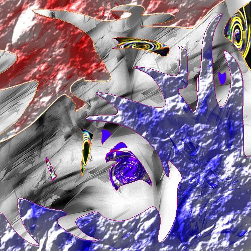
I didn't doubt he didn't just throw it together easily... It looks pretty... complicated I guess. But it doesn't change the fact that it looks pretty bad.SHOUTrvb wrote:I like how every person who has posted here knows exactly what they're talking about and has tons of room to talk. Honestly, NSN's post applies to you guys. This image doesn't suck; in fact it's not even that bad. Basically it was mainly just very poorly put together. He actually used some fairly interesting techniques to achieve certain effects. This image isn't very good, but if you apply what you've learned from this one to other ones you'll eventually get a better hang of things. It takes a lot of time, and it's good that you're working towards getting better. You may also ignore the people above me; most of them are beyond terrible at any sort of graphics art.
Everyone in this thread (excluding plushiefire & Voltage) have officially lost -5 respect from me.

|
|
I agree with the first half of that paragraph, but you can't deny the fact that it looks bad. Anyway, I tried to be respectful, read the end of my post:SHOUTrvb wrote:I like how every person who has posted here knows exactly what they're talking about and has tons of room to talk. Honestly, NSN's post applies to you guys. This image doesn't suck; in fact it's not even that bad. Basically it was mainly just very poorly put together. He actually used some fairly interesting techniques to achieve certain effects. This image isn't very good, but if you apply what you've learned from this one to other ones you'll eventually get a better hang of things. It takes a lot of time, and it's good that you're working towards getting better. You may also ignore the people above me; most of them are beyond terrible at any sort of graphics art.
Everyone in this thread (excluding plushiefire & Voltage) have officially lost -5 respect from me.
So, if you want my honest opinion, this is a hell of a lot better than my first graphics (and I'm still not that great at sigs), but that doesn't change the fact that this is bad, but it does have some cool effects that I like.I wrote:The one JK linked is good, try some tutorials and keep trying. You'll get better.

Dr.Cox wrote:gh0570fchurch has a mexi-stash. =D

Filters And Brushes (damn you shout always correcting meSHOUTrvb wrote:I like how every person who has posted here knows exactly what they're talking about and has tons of room to talk. Honestly, NSN's post applies to you guys. This image doesn't suck; in fact it's not even that bad. Basically it was mainly just very poorly put together. He actually used some fairly interesting techniques to achieve certain effects. This image isn't very good, but if you apply what you've learned from this one to other ones you'll eventually get a better hang of things. It takes a lot of time, and it's good that you're working towards getting better. You may also ignore the people above me; most of them are beyond terrible at any sort of graphics art.
Everyone in this thread (excluding plushiefire & Voltage) have officially lost -5 respect from me.


