Page 1 of 1
Chaz
Posted: Mon Apr 16, 2007 5:39 pm
by Dalto11
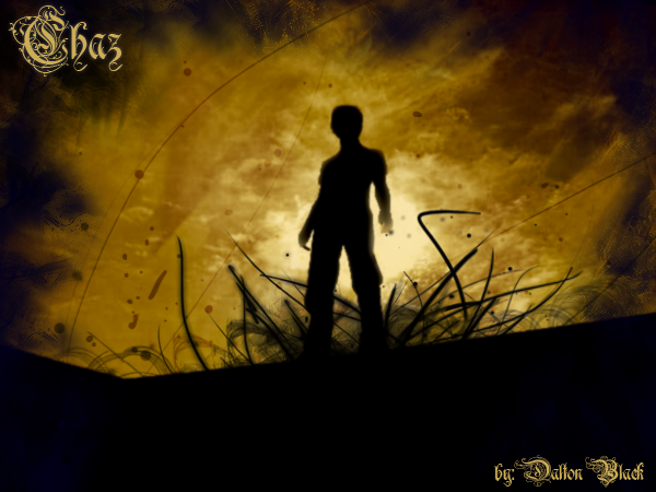
I know it's all simple brush work, level editing and what not, but what do you guys think?
Orginal:

Mine:
Posted: Mon Apr 16, 2007 5:55 pm
by G.I.R.
o.o Neat.
Posted: Mon Apr 16, 2007 6:06 pm
by SHOUTrvb
Pretty simple and I don't quite dig the text, but a great piece none the less.
Posted: Mon Apr 16, 2007 6:07 pm
by Dalto11
SHOUTrvb wrote:Pretty simple and I don't quite dig the text, but a great piece none the less.
got any suggested fonts?
Posted: Mon Apr 16, 2007 6:08 pm
by SHOUTrvb
Well, I usually prefer to make my own fonts for bigger images. However, since the text isn't meant to be a focus in this piece, I'd just go with a simple Tahoma. You want it out of the way.
Posted: Wed Apr 18, 2007 3:01 pm
by Xiion
axeraider08's brushes... i used those many times... its not the best choice for colors.
Posted: Wed Apr 18, 2007 3:12 pm
by Jordan
I like it, but the left hand (our right) is a little weird. Think you could hook me up with a link to those brushes?

:)
Posted: Thu Apr 19, 2007 7:51 pm
by Dalto11
Posted: Thu Apr 19, 2007 7:57 pm
by Xiion
woops meant axeraider70... he's pretty good at abstract brushes. definently worth the dl's.
Posted: Fri Apr 20, 2007 2:27 pm
by Leiukemia
Looks dope. I think the text fits it well, but I'd only have the Chaz thing in the corner. Nice job.
Posted: Fri Apr 20, 2007 3:52 pm
by noscottno
I'm hoping to do stuff like this once I get a tablet in summer (ugh).
Very nice work.
Posted: Fri Apr 20, 2007 5:10 pm
by fishface617
Cool, except the bottom right is too...black...