Some Of the sigs Ive Made in the Past Few Days

Wanna show off your Sig/Avatar/artwork. Well this is the place to do it!
Post Reply
GM_Battleman021


Posts: 70
Joined: Mon Mar 05, 2007 11:48 am
Location: Making Modz :p

Some Of the sigs Ive Made in the Past Few Days

Post by GM_Battleman021 »

Rate 10/10?

Yes i know that they are too big; however im posting them as a piture, i do not plan using them on this site due to rules. But here they are.

And this is cool to if u like userbars and u like the 360 elite add this to your collection, i made myself.
Image

Image

Image

And here is my most resent sig that i made today--->

Image

And by the way BG Blood 1 is my new mlg account..
-Battleman021-
-Admin Of Gangsta Modz-
Image
User avatar
DRL333


Posts: 1668
Joined: Wed Jul 05, 2006 6:49 pm
Location: Building more Turalbots!

Post by DRL333 »

1. Looks pretty good, I just don't like how blurry the Xbox 360 logo is.

2. Looks good, exept for the text.

3. As with 2, it looks good, but the text doesn't.

4. I don't like animated sigs.

2, 3, and 4 break the sig rules if you didn't already know.
Last edited by DRL333 on Mon Apr 09, 2007 9:08 am, edited 1 time in total.
Valve > Bungie
Image
Making abstract graphics again and better than ever!
GM_Battleman021


Posts: 70
Joined: Mon Mar 05, 2007 11:48 am
Location: Making Modz :p

Post by GM_Battleman021 »

Folkluv333 wrote:1. Looks pretty good, I just don't like how blurry the Xbox 360 logo is.
2, 3, and 4 break the sig rules if you didn't already know.
If you read you would realize that i knew and what i was doing, also it is blury because i added a gussain blur and faded it with a lighten..
-Battleman021-
-Admin Of Gangsta Modz-
Image
User avatar
Cuda


Grunge

Posts: 5725
Joined: Tue Oct 18, 2005 2:59 pm
Location: Torrance, CA

Post by Cuda »

Ah, another collection to critique. *Cracks Knuckles*

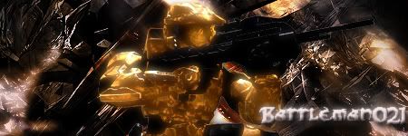
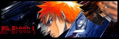
1st, the Border on the last two, is way too thick and the 3rd, with the gradient border is pretty bad, The heavy brushing on all but the bar ruins the actual flow of the sigs, text color/font/ effect is bad, and could use improvement, such as the removal of the bevel on the 2nd, changing color on the 3rd one, and the over blurred turd color on the 4th has to go. The font on all of them is not the best choice, I suggest a cleaner font, Like Arial Black, (with formatting and tweaking), or Arial (with format and tweaking). The animation shouldn't go against the flow, but with it. if you were going for a rain effect, have sections interact with points on the render, and for a film grain effect, have it more incremental, instead of a constant. Finally, the bar. Lessen the scanlines, and try the Xbox 360 font itself, in Uppercase, with relevant colors.

Ratings:

The XBox 360 Elite Userbar; 7/10
Halo sig; 6/10
1st Bleach sig; 7/10
2nd Bleach sig; 6/10.

You have room to improve on all of them, keep at it.
Image
Post Reply