Page 1 of 1
new sig in awhile
Posted: Thu Apr 05, 2007 4:04 pm
by bronchidus
Well ive only been oin either, 1.)non-sigs in ps. or, 2.) 3ds max stuff. So I finnally decided to make a sig! lol
2 versions
V1
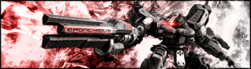
This one has no blending done to the mech
V2
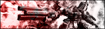
Has blengind thats somewhat subtle imo.
So rate them comment on which is better w/e. I just want input lol
Posted: Thu Apr 05, 2007 4:14 pm
by Th2mods
i like v1 the best, maybe it would be better if you can read the text a little better on the gun. although its on there from the render i don't think that is possible
overall : 8/10
Posted: Thu Apr 05, 2007 6:21 pm
by FReAK
Nope, that's not on the render at all. It says "bronchidus", which is his name. Damn good for a first sig. Especially the text, I had to look a second time to make sure that it wasn't part of the render and was actually his name.
Posted: Thu Apr 05, 2007 6:45 pm
by bronchidus
thanks but its not a first but ive havent seriously done one in ps for like... idk december lol i did some in paint.net and gimp but they werent good so i quit 2 months ago. Ive just been doing big pieces for the past couple of weeks since i got creative suite.
Posted: Thu Apr 05, 2007 7:51 pm
by DRL333
Damn, that's really good, I like V1 the best.
Posted: Thu Apr 05, 2007 8:33 pm
by Leiukemia
definantly v1, looks great.
Posted: Thu Apr 05, 2007 8:52 pm
by bronchidus
haha i guess that sharpened part is growin on me. i didnt like it before but now it makes it look more... mystical idk lol
Posted: Sat Apr 07, 2007 5:14 am
by dante23
definantly v1, looks great.
same overall 7.9/10