Page 1 of 1
2nd Sig EVER!
Posted: Mon Mar 12, 2007 11:02 pm
by sOdXavieR
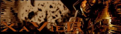
hey my 2nd sig, lol, check out my old one, the topic is, "my 1st sig EVER" lol, heres my 2nd, id appreciate some constructive critism, ty, and ty, to everyone who posted in my last sig, it helped alot.
Posted: Mon Mar 12, 2007 11:06 pm
by Tural
Image quality could be better, but I like the overall look.
Posted: Mon Mar 12, 2007 11:43 pm
by Cuda
Avoid using Halo text.
Posted: Tue Mar 13, 2007 1:20 am
by d3mon
looks to me like you have discovered the liquify filter
Posted: Tue Mar 13, 2007 10:31 am
by SHOUTrvb
You know, it doesn't look horrible. A step up from your last indeed, so I can tell you're trying. I think a sharper approach would work better for this sort of image. I'll show you what I mean in a moment.
Posted: Tue Mar 13, 2007 10:40 am
by Kirk
d3mon wrote:looks to me like you have discovered the liquify filter
Actually to tell the truth, I kinda like the effect it made on the MC on the right side.
Posted: Wed Mar 14, 2007 12:08 am
by d3mon
yea it does look good on the right side but it sorta wrecked the left side
Posted: Wed Mar 14, 2007 2:22 am
by CabooseJr
The Halo text has got to go, the halo text should only go on Halo games.
Posted: Wed Mar 14, 2007 12:24 pm
by Mourge
hmm...try different color variations so your render doesnt blend in too much with your background cuz then it fights with the eyes of the spectator...and yeah