Wanna show off your Sig/Avatar/artwork. Well this is the place to do it!
Two-One
Posts: 330 Joined: Mon Jan 09, 2006 7:21 pmLocation: Around The Corner
Contact:
Post
by Two-One Fri Feb 23, 2007 12:20 pm
C & C
Last edited by
Two-One on Sat Feb 24, 2007 8:46 am, edited 1 time in total.
Hi.
r0tten
Readers Club Posts: 1734 Joined: Sun Jan 22, 2006 8:41 pm
Post
by r0tten Fri Feb 23, 2007 12:51 pm
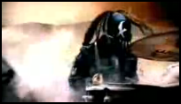
i'm not really afan of any of them, the render looks like it's just pasted on there, especially the rifle. maybe it's just a bad render.
Two-One
Posts: 330 Joined: Mon Jan 09, 2006 7:21 pmLocation: Around The Corner
Contact:
Post
by Two-One Fri Feb 23, 2007 1:27 pm
r0tten wrote: i'm not really afan of any of them, the render looks like it's just pasted on there, especially the rifle. maybe it's just a bad render.
Mk.
Thanks for the comment.
Hi.
r0tten
Readers Club Posts: 1734 Joined: Sun Jan 22, 2006 8:41 pm
Post
by r0tten Fri Feb 23, 2007 1:42 pm
yeah i usually like your work alot more, your blending is usually very well done.
LostWithin
Posts: 483 Joined: Mon Jul 17, 2006 4:10 pmLocation: Massachusetts Team:FoxHalo.com
Contact:
Post
by LostWithin Fri Feb 23, 2007 1:57 pm
My opinion says not smexy.
Click my sig and register or get in my belly!
New clan and new leadership.
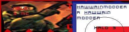
Hawaiian Modder
Posts: 2154 Joined: Sat Nov 26, 2005 7:17 pmLocation: In a cave smokin up with tupac and big foot.
Post
by Hawaiian Modder Fri Feb 23, 2007 2:09 pm
You have a picture of that render?
Thanks lej for the sig.
Dr.Cox wrote: I like Cox.
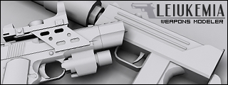
Leiukemia
Posts: 575 Joined: Mon Oct 23, 2006 2:59 pm
Post
by Leiukemia Fri Feb 23, 2007 3:11 pm
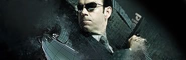
I'm not a big fan of it. Don't really like that part in the middle that's like cut and moved, or whatever beens done to it.
Ombre
Posts: 2495 Joined: Sat Dec 11, 2004 12:42 amLocation: California - Bay Area
Post
by Ombre Sat Feb 24, 2007 2:58 am
The text is almost invisible, and just doesn't look good at all, the background isn't any better.
Two-One
Posts: 330 Joined: Mon Jan 09, 2006 7:21 pmLocation: Around The Corner
Contact:
Post
by Two-One Sat Feb 24, 2007 5:04 am
Ombre wrote: The text is almost invisible
Thats the point.
Anyways, thanx for the comments...
Hi.
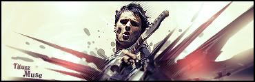
Titusz
Posts: 549 Joined: Wed Nov 29, 2006 8:04 am
Post
by Titusz Sat Feb 24, 2007 5:36 am
I didn't even noticed the text at first
ps: you made a typo in the topic title Ω ☻ <---OMFG, they're breeding
RaVNzCRoFT
Posts: 6208 Joined: Mon Jan 10, 2005 3:05 pmLocation: Raleigh, North Carolina, USA
Post
by RaVNzCRoFT Sat Feb 24, 2007 7:00 am
Two-One wrote: Ombre wrote: The text is almost invisible
Thats the point.
Text is pointless if you can't even see it. If you're bad at text, don't put it in. But like I've said before, putting text in so that you can't see it is just stupid.
Two-One
Posts: 330 Joined: Mon Jan 09, 2006 7:21 pmLocation: Around The Corner
Contact:
Post
by Two-One Sat Feb 24, 2007 8:45 am
RaVNzCRoFT wrote: Two-One wrote: Ombre wrote: The text is almost invisible
Thats the point.
Text is pointless if you can't even see it. If you're bad at text, don't put it in. But like I've said before, putting text in so that you can't see it is just stupid.
And thats your opinion.
Thanx for the chat about text.
Hi.
UPS
Posts: 1011 Joined: Wed Mar 29, 2006 6:18 amLocation: In your lap.
Post
by UPS Sat Feb 24, 2007 3:52 pm
I can't even find the text...
gh0570fchurch
Posts: 3374 Joined: Sat Oct 01, 2005 11:04 amLocation: San Diego Area, CA
Contact:
Post
by gh0570fchurch Sat Feb 24, 2007 6:37 pm
It's to the left of the center render. The "TWO" is more visible than the "ONE".
Dr.Cox wrote: gh0570fchurch has a mexi-stash. =D
DRL333
Posts: 1668 Joined: Wed Jul 05, 2006 6:49 pmLocation: Building more Turalbots!
Post
by DRL333 Sat Feb 24, 2007 7:58 pm
Hawaiian Modder wrote: I like the sig, but not as much as your previous ones.
Valve > Bungie
Making abstract graphics again and better than ever!


