Page 1 of 1
Dead Rose
Posted: Tue Feb 20, 2007 10:45 pm
by Ombre
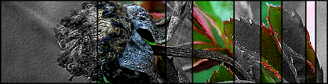
Not really sure what went on with this one, I was just going to do a simple photo enhance in photoshop, but I ended up adding more.
Took the original photo today in my backyard.

V2?

Original:

Posted: Tue Feb 20, 2007 10:47 pm
by Pyroman
Oh so that's what that is.

Wait...you took that photo? That's awesome dude.
Posted: Tue Feb 20, 2007 10:55 pm
by r0tten
looks like you just reduced noise on it then left a few areas sharp then raised the contrasgt on them, not a fan. sry.
maybe if you kept the hand blurry/reduced noise and kept more focus on the rose by sharpening it and what not. i dunno, to each there own.
Posted: Tue Feb 20, 2007 10:57 pm
by GametagAeonFlux
Did you brush in random spots with black or are those the original shadows?
Posted: Tue Feb 20, 2007 11:06 pm
by Ombre
Those are the original shadows. I didn't reduce noise.
Posted: Tue Feb 20, 2007 11:40 pm
by r0tten
ok, i only said that cause the hand lacked detail and looked quite pail.
Posted: Tue Feb 20, 2007 11:48 pm
by Ombre
*Added V2 and original.* I guess those aren't so much shadows as they were just the bottom of the leaves.

I decided to make most of the leaves just pure red for dramatic effect.
Posted: Tue Feb 20, 2007 11:58 pm
by ScottyGEE
It is really an odd sight as so many areas are in or out of focus... Sharp bits blurred bits, I don't actually focus on the rose as a whole I notice one leaf...
Hmm its a tough choice for which I like more, I like some aspects of each...
Posted: Wed Feb 21, 2007 1:20 am
by Keablr
Ha I knew it was a flower, that is pretty sweet Ombre
Posted: Wed Feb 21, 2007 5:12 pm
by gh0570fchurch
I like it.

The original is pretty nice, too.
Posted: Wed Feb 21, 2007 8:18 pm
by r0tten
i really liked the original so i made this sig, i'm not trying to hijack your thread so if you want me to take this off i will, consider it flattery though.
Posted: Wed Feb 21, 2007 8:25 pm
by GametagAeonFlux
r0tten, I'm sorry but that looks awful.
Posted: Wed Feb 21, 2007 8:27 pm
by RaVNzCRoFT
I'm sorry, but I couldn't help but crack up at GTAF's post.

Posted: Wed Feb 21, 2007 9:20 pm
by r0tten
GametagAeonFlux wrote:r0tten, I'm sorry but that looks awful.
yeah it looked better before i saved for web, but i still like it, too bad no one else does...

Posted: Fri Feb 23, 2007 2:12 pm
by Ombre
It was a nice concept, just bad execution.
Posted: Fri Feb 23, 2007 3:21 pm
by Sarb
I really like it, Ombre.
GOOD JOB!
Posted: Fri Feb 23, 2007 5:44 pm
by Nitemare
wow thats cool!