Page 1 of 1
My new Desktop[five-six-Kay Warning]
Posted: Sun Dec 17, 2006 12:13 am
by Cuda
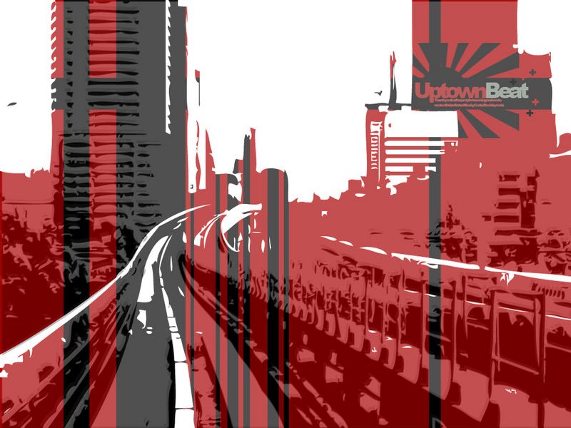
Vectored stock recolored a bit. Desktop size and free for use.
Posted: Sun Dec 17, 2006 12:15 am
by Darco
looks good
Posted: Sun Dec 17, 2006 6:05 am
by Patrickssj6
I love it but you have to remove that black spot at the upper left corner.
Posted: Sun Dec 17, 2006 7:34 am
by Nitemare
looks good
Posted: Sun Dec 17, 2006 8:30 am
by RaVNzCRoFT
Your screen resolutions are low. >_>
Posted: Sun Dec 17, 2006 9:41 am
by The_Hushed_Casket
RaVNzCRoFT wrote:Your screen resolutions are low. >_>
Honestly, it looks good, but 800 x 600 = bleh.
Posted: Sun Dec 17, 2006 11:43 am
by Cuda
Original is 1024X768. Sadly, Photobucket autoresizes to 800X600. I'll get a higher res one up in a few.

Posted: Sun Dec 17, 2006 12:44 pm
by MaestroMan
Nice, reminds me of the "Rising Star" skateboard deck by Chad Muska ... He also created beats and skated uptown
Posted: Sun Dec 17, 2006 12:58 pm
by RaVNzCRoFT
Cuda, you fail at posting higher-resolution pictures. >_>
Posted: Sun Dec 17, 2006 1:22 pm
by Darco
LOL @ Cuda.
try this instead.

since there is a 56k warning, i dont think there is a reason to use thumbnails.
Posted: Sun Dec 17, 2006 2:40 pm
by Phosphorous
I wish there was more sense in the coloring, I don't like it striped.
Posted: Sun Dec 17, 2006 2:41 pm
by halobuddha
wow everybody is like in power from when i posted earlier lol it kinda makes me think what i would have been lol (id probably be the forum B#$@ lol) anyways very nice i like the fact that it is simple it seems like hushed casket style ya know? omg and phosphorous is here!!!1
Posted: Sun Dec 17, 2006 3:14 pm
by Cuda
MaestroMan wrote:Nice, reminds me of the "Rising Star" skateboard deck by Chad Muska ... He also created beats and skated uptown
Well, he too used the Japanese Imperial Flag in his deck designs.
Phosphorus wrote:I wish there was more sense in the coloring, I don't like it striped.
The Stock was taken in Japan, Hence the Red and white, and the Gray and black tones were added for details to the image.
RaVN wrote:Cuda, you fail at posting higher-resolution pictures. >_>
No U.
Posted: Sun Dec 17, 2006 4:58 pm
by gh0570fchurch
Awesome art style!

Love it.
Posted: Sun Dec 17, 2006 5:21 pm
by Phosphorous
Cuda wrote:
The Stock was taken in Japan, Hence the Red and white, and the Gray and black tones were added for details to the image.
No, the colors arent bad, its where you used them. I just don't like how its randomly striped.
Posted: Sun Dec 17, 2006 7:28 pm
by Cuda
Well, anyways, in the files forum, I got another topic with the same stuff, but theres an Icon pack I made there, so I suggest you check it out.
http://files.halomods.com/viewtopic.php?t=63412