Page 1 of 2
WIP
Posted: Fri Sep 22, 2006 6:46 pm
by Sandman
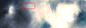
I need to fix a few parts.. just not sure how to go about it..

Suggestions welcome
Posted: Fri Sep 22, 2006 7:07 pm
by gh0570fchurch
What the hell is it?
Posted: Fri Sep 22, 2006 7:11 pm
by Sandman
Something called abstract. The same as your sig..
Posted: Fri Sep 22, 2006 7:12 pm
by gh0570fchurch
Yeah, I know what you mean. But it almost seems like it's actually supposed to look like something you just can't tell what. With mine, it's obviously abstract.

Posted: Fri Sep 22, 2006 7:20 pm
by Sandman
Oh, I dunno, haha. It wasn't made from a stock or anything.. it's all defaults. I guess that's up to interpretation by the viewer
Posted: Fri Sep 22, 2006 7:33 pm
by angry man
sorry it's just too... blah. the brightness just kills it.
Posted: Fri Sep 22, 2006 7:53 pm
by Dr.Cox
ugh... You killing your style man.. try something else besided the same looking stuff over and over and over and oover and over again.
Posted: Sat Sep 23, 2006 5:08 am
by Grunt Rebel
Armed Civilian wrote:ugh... You killing your style man.. try something else besided the same looking stuff over and over and over and oover and over again.
Posted: Sat Sep 23, 2006 10:54 pm
by Grave
it kinda looks like your current sig.
Posted: Sun Sep 24, 2006 5:16 am
by RaVNzCRoFT
Have you experimented with space art? You'd be insane at it.
Posted: Sun Sep 24, 2006 6:41 am
by Sandman
I have actually..
http://www.deviantart.com/deviation/14225306/
That was from a year or two ago..
I really can't make good planets b/c my computer is too slow. It can't support the huge 2000px by 2000px canvas that all the tuts call for.. it'll start freezing up really easily
This planet was a really easy one that I made and colored and everything..
Posted: Sun Sep 24, 2006 6:56 am
by metkillerjoe

.
Woah, the beauty of that pic blinded me.
Posted: Sun Sep 24, 2006 7:21 am
by dos mes
@ the deviant art -
Wow
That's all that can be said...
Posted: Sun Sep 24, 2006 8:18 am
by Phosphorous
Your text in that sig is basically unreadable.
Posted: Sun Sep 24, 2006 9:05 am
by Kirk
Actually that deviant art picture has some very obvious, and quite frankly ulgy errors. First of all the explosion appears to be happening on space, and not the planet itself.
Posted: Sun Sep 24, 2006 9:08 am
by RaVNzCRoFT
metkillerjoe wrote: .
Woah, the beauty of that pic blinded me.
Dos Mes wrote:@ the deviant art -
Wow
That's all that can be said...
No offense to Sandman, but the space scene isn't that great.
Posted: Sun Sep 24, 2006 9:14 am
by dos mes
Idk, I liked it a lot, cause it was his sandish style, not just a straight up space scene. And considering I blow as gfx is amazing to me.
Posted: Sun Sep 24, 2006 9:25 am
by Sandman
Yes, and like I said.. that was from a year or two ago.. and I really haven't tried much with spacescenes since then.. too time consuming.
Posted: Sun Sep 24, 2006 10:38 am
by gh0570fchurch
Phosphorous wrote:Your text in that sig is basically unreadable.
Wait, there's text?
Posted: Sun Sep 24, 2006 10:43 am
by dos mes
gh0570fchurch wrote:Phosphorous wrote:Your text in that sig is basically unreadable.
Wait, there's text?
Yea, although it's very hard to read as Phosphorous stated. I encased it in a picture for you.