Page 1 of 1
i think i'm getting better...
Posted: Mon Jul 17, 2006 8:18 am
by [cc]z@nd!
well, it's definitely better than my current... i was making it for a tutorial on basic sig creation on forums that me and my friends run (
tinyurl.com/b4bkt)
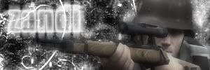
first version

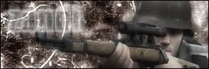
second version, i think the text blends better in this one
toughts? suggestions?
Posted: Mon Jul 17, 2006 8:24 am
by wes
you should color the background more.
try using borders.
the text is the first thing i look at when i see the signature, IMO it's a bad thing.
i see you made this for a basic sig, i guess it's OK. the bottom one is better
Posted: Mon Jul 17, 2006 10:17 am
by [cc]z@nd!
yeah, i like the bottom one better, better text blending. i kinda like the black and white background, but the text does need to be toned down a bit, here's a more recent one. not much change..
Posted: Mon Jul 17, 2006 10:18 am
by wes
better, but the bright whiteness of the text is still a little disturbing.
Posted: Mon Jul 17, 2006 10:23 am
by [cc]z@nd!
problem is that the glow i have on it makes it kinda fuzzy, so lowering it's opacity more will make it harder to read. i'll work on it...
Posted: Mon Jul 17, 2006 10:33 am
by RaVNzCRoFT
The render is very low-quality and low-resolution.
Posted: Mon Jul 17, 2006 11:00 am
by xXxCocoFangxXx
Very nice! Look good.
Posted: Mon Jul 17, 2006 11:53 am
by [cc]z@nd!
RaVNzCRoFT wrote:The render is very low-quality and low-resolution.
i just snagged one off the internet somewhere and did the gaussian blur trick to blend it in a bit, and had the unblurred render's opactiy lowered some.
Posted: Mon Jul 17, 2006 12:45 pm
by Phosphorous
Add a nice 1 pxl border.
Posted: Mon Jul 17, 2006 8:06 pm
by [cc]z@nd!
i did on that last one in the third post. 1 px black on the inside.
Posted: Tue Jul 18, 2006 5:44 am
by Phosphorous
Ok, now fix the text on your current.
Lower the glows and raise the opacity and use a blend mode. Photoshop users love to use overlay, but I dont really now what that does O_O, so experiment with it.
Posted: Tue Jul 18, 2006 6:39 am
by Rob
Nice

Posted: Tue Jul 18, 2006 6:53 am
by [cc]z@nd!
will-do. man, this thread has too many snipers in it, i'm getting dizzy

edit: ok, here's another tweak. i changed the background to have a slight blue coloration, a bit stronger now. i couldn't change blending options on the text because it used a black font and the layer was set on screen, although i did mess with the glow options and transparency and fill.

hmm, maybe a bit much blue...
Posted: Tue Jul 18, 2006 4:24 pm
by Sandman
Put the text layer on overlay and duplicate it a few times..
Then make a new layer, fill it with another color and mess with the blending modes (ie. overlay, colordodge, soft light).
And also, when you're blending, sometimes it helps to put a copy of the background layer overtop the render, then erase over the render with a low opacity eraser
Posted: Tue Jul 18, 2006 6:36 pm
by Phosphorous
The blue looks kinda bad.
Posted: Thu Jul 20, 2006 12:50 pm
by gh0570fchurch
[cc]z@nd! wrote:hmm, maybe a bit much blue...
Yeah...