Page 1 of 1
Sigs
Posted: Mon Jul 10, 2006 4:00 pm
by Wicked 0666
Posted: Mon Jul 10, 2006 6:48 pm
by RaVNzCRoFT
I like the style. They could use borders, though.
Posted: Mon Jul 10, 2006 7:48 pm
by JK-47
They are actually really awsome! Nice job

Posted: Mon Jul 10, 2006 8:25 pm
by maca_§
Don't like them at all sorry.
To clustered.
Posted: Tue Jul 11, 2006 12:19 am
by Cuda
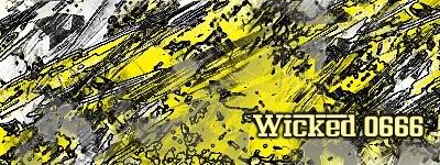
Text and size for me. Feena Rosso and that loopy cursive font lok a bit strange on the jagged and sometimes clashing lines of the sig.
Posted: Tue Jul 11, 2006 8:39 am
by Dr.Cox
multi-genre wrote:They are actually really awsome! Nice job
RaVNzCRoFT wrote:I like the style. They could use borders, though.
>_> dont listen to the stoners

Yah the size. and te text need to go.
Posted: Tue Jul 11, 2006 9:12 am
by Wicked 0666
yeah text has always been my problem
Posted: Tue Jul 11, 2006 10:19 am
by xXxCocoFangxXx
I don't like either.
Posted: Tue Jul 11, 2006 11:00 am
by Grunt Rebel
I like the BGs but not the text. Blue ftw!
Posted: Tue Jul 11, 2006 2:42 pm
by gh0570fchurch
I don't like them either.
Posted: Tue Jul 11, 2006 4:26 pm
by Phosphorous
They both seem a bit sloppy.