Page 1 of 1
im back with two new sigs *Updated*
Posted: Wed May 17, 2006 4:05 pm
by gh0570fchurch
ok, im finally back with two new sigs:
the first one
yes i know its a H3 sig, but i actually made this the day after the trailer was released, so

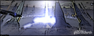
and the second one
i already know cuda does like it, but:

RnC
Re: im back with two new sigs
Posted: Wed May 17, 2006 4:07 pm
by Cuda
gh0570fchurch wrote:
i already know cuda doesn't like it
I was just kidding
Bottom one for me is prolly the better of the two.
Posted: Wed May 17, 2006 4:10 pm
by Phosphorous
I like the bottom better, but the text needs help.
Posted: Wed May 17, 2006 4:11 pm
by gh0570fchurch
there i edited it

but do you agree that im getting better at this? (ill work on the text, but i dont really have much experience with doing text in gimp yet)
EDIT: and heres the original of the second one, for comparison:
http://www.winnacunnet.k12.nh.us/constr ... CF0061.JPG
Warning: large file size pic
Posted: Wed May 17, 2006 4:23 pm
by RaVNzCRoFT
Phosphorous wrote:The text needs help.
I like the top one better, but you really didn't do much. It's just a filter and some thrown-in text. You're using Photoshop, correct?
Posted: Wed May 17, 2006 4:25 pm
by gh0570fchurch
no, i switched to gimp a long time ago (photoshop trial expired, and to tell you the truth, i make better sigs with gimp than photoshop)

(dont ask, i dont get it either)
btw, the first one is more than filter, though not much. i also added some extra lighting effects above the ark (gimp can do some rly cool lighting)
EDIT: updated
Posted: Wed May 17, 2006 6:23 pm
by xXxCocoFangxXx
I like it!
Posted: Wed May 17, 2006 6:26 pm
by gh0570fchurch
should i current either of them?
Posted: Thu May 18, 2006 5:57 am
by Grave
you should have maybe tried to do bloody looking text for it.
Posted: Thu May 18, 2006 5:58 am
by Kurroda
Current the 2nd one it is better then your current now.
Posted: Thu May 18, 2006 3:54 pm
by maca_§
I agree, second one.
Posted: Thu May 18, 2006 5:38 pm
by gh0570fchurch
so, is the second one ready for a current? or, i have an idea, maybe if i engrave the text into the ground somewhere, maybe that would look better (if i can figure out how to do that in gimp)
Posted: Thu May 18, 2006 5:41 pm
by Cuda
No, Just leave it and current
Posted: Thu May 18, 2006 5:50 pm
by gh0570fchurch
oops, too late, already did
i didnt exactly engrave the text, but:

Posted: Thu May 18, 2006 6:02 pm
by Cuda
Ctrl+Z is your friend...
Just leave it alone. Don't fix it if it isn't broken.
Posted: Thu May 18, 2006 6:04 pm
by gh0570fchurch
well i think that i should get more ppl's opinion before i make a choice on which one to current (yes, i am going to current one of them, just need to figure out which one)
Posted: Fri May 19, 2006 2:52 am
by Grunt Rebel
I like the second one with the bloody text.