Page 1 of 1
Supernova
Posted: Thu Mar 30, 2006 9:01 am
by jks
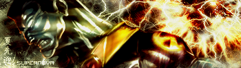
I dont really know what but something about this sig doesnt seem right. I know the first thing you guys are going to say is the colors, but I wanted the main part to have a color that would really contrast with the supernova part to give it emphasis, maybe my color choice for the main part was bad...
Posted: Thu Mar 30, 2006 9:27 am
by gh0570fchurch
i like it, nice brushing on the right.
Posted: Thu Mar 30, 2006 9:28 am
by wes
the background is nice
Posted: Thu Mar 30, 2006 11:24 am
by McFarlane
Eh...
Posted: Thu Mar 30, 2006 2:04 pm
by Doctor
Nice job, jks. The o in supernova is a little hard to read, but its fine for the most part. I say current =/
Posted: Thu Mar 30, 2006 2:28 pm
by Patrickssj6
I think the right side is so intenisve it redirects my eyes from the render to the right side
But else I really REALLY like it

Re: Supernova
Posted: Thu Mar 30, 2006 3:51 pm
by maca_§
jks wrote:I dont really know what but something about this sig doesnt seem right.
I think it's the render's face, the colour of that and just the facial expression distorts the rest.
Other then that it looks good, 7.8/10.
Posted: Fri Mar 31, 2006 9:35 am
by jks
Patrickssj6 wrote:I think the right side is so intenisve it redirects my eyes from the render to the right side
But else I really REALLY like it
Its supposed to >_>
Posted: Tue Apr 04, 2006 3:48 pm
by Phosphorous
I think the lack of detail on the renders face is what makes it not seem "right". It sorta contrasts with the detailed/sharpened background.
That's just my 2 cents though.
Posted: Tue Apr 04, 2006 6:30 pm
by Spartan Sniper
i like the way you do your sigs jks
they're very intresting to look at
8.5/10