Page 1 of 1
My newest sig.
Posted: Tue Mar 21, 2006 4:56 pm
by Cuda
I got bored and Decided to put some effort in a sig, so I made this.
I know the render is overused, but rate the sig, not the render.
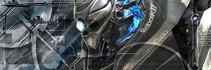
R&C, Current or not to, More to come.
You know the drill
Posted: Tue Mar 21, 2006 5:01 pm
by Dr.Cox
i gave that render to him

so i get credit

very nice... cept that i think there is just too much tech brushin
i anite diggin the text for some reason looks strange
i kinda dont like the eye and the neck it just looks weird...
mono to mono
but yah i still like it
8.5/10
Posted: Tue Mar 21, 2006 5:06 pm
by Phosphorous
Pretty cool, I always liked good tech sigs.
Posted: Tue Mar 21, 2006 5:28 pm
by RaVNzCRoFT
Phosphorous wrote:Pretty cool, I always liked good tech sigs.
...except this isn't a good tech sig...
I like it, probably an 8/10.
Posted: Tue Mar 21, 2006 5:38 pm
by Phosphorous
RaVNzCRoFT wrote:Phosphorous wrote:Pretty cool, I always liked good tech sigs.
...except this isn't a good tech sig...
I like it, probably an 8/10.
8/10 is good, I still like it. Its not amazing, but Im partial to tech sigs.
Posted: Wed Mar 22, 2006 7:29 pm
by Cuda
I told you there was more to come, so here it is.

Tsuin Taiyou added his awesome godly PS touch to it and made an even more awesomer sig.
Posted: Wed Mar 22, 2006 7:47 pm
by Kurroda
i dont wont to be mean but i think that one is worse the first is much better
thats my opinion
Posted: Wed Mar 22, 2006 8:01 pm
by gh0570fchurch
yeah i agree. the difference isnt much, but if were to pick which was best, i would say the second.
Posted: Wed Mar 22, 2006 9:57 pm
by Kurroda
just cant see the render to good
Posted: Wed Mar 22, 2006 11:41 pm
by maca_§
Very nice, I love the blue.
Posted: Thu Mar 23, 2006 12:19 am
by Cuda
[quote="maca_
Posted: Thu Mar 23, 2006 12:30 am
by maca_§
On the part of the Sig that is most obviously blue..
Posted: Thu Mar 23, 2006 5:53 pm
by Cuda
well a lot of the sig is blue... You mean the neck?
Posted: Thu Mar 23, 2006 6:51 pm
by RaVNzCRoFT
I like the first one more. It just seems more appealing overall. But please fix the text; I can barely read it, and it looks bad.