Page 1 of 1
My Latest sig.
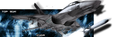
Posted: Fri Feb 10, 2006 3:41 pm
by Cuda
Its kinda a vector sig, but at the same time, its not.... wierd Huh?

Posted: Fri Feb 10, 2006 4:19 pm
by fourn443
its kinda plain, mb add some color?
Posted: Fri Feb 10, 2006 5:06 pm
by Cuda
its a vector sig, its not supposed to be very busy.
Posted: Fri Feb 10, 2006 5:09 pm
by Dr.Cox
i really like this one

4.67/5
Posted: Fri Feb 10, 2006 5:11 pm
by [TS]
I like it maybe lower the stroke on the text a bit, and if you can maybe show the arrows in the reflection of the mirrors, that would be nice.
Posted: Fri Feb 10, 2006 6:23 pm
by fourn443
Cuda wrote:its a vector sig, its not supposed to be very busy.
i know but i just dun like its plainness, maybe u could add some vectors in a different direction? dunno im not so good at vector.
Posted: Fri Feb 10, 2006 8:19 pm
by maca_§
Cuda wrote:its a vector sig, its not supposed to be very busy.
This is Vector and it's very busy.
Anyway I don't really like this Sig. All it is two brushes and some text.
Posted: Fri Feb 10, 2006 10:17 pm
by JK-47
well, I still like it. 7.75/10.
Posted: Sat Feb 11, 2006 5:30 am
by RaVNzCRoFT
You're back?
And I don't really like the signature. It's got a nice look, but even as a simplicity vector it's just too simple. And how can I say this...the stroke on the text needs to die.
Posted: Sat Feb 11, 2006 8:16 am
by lxNicktardxl
RaVNzCRoFT wrote: And how can I say this...the stroke on the text needs to die.
This sig kind of makes me sick because of how the buildings are positioned...its hard to explain, but overall i like it
Posted: Sat Feb 11, 2006 8:30 am
by fourn443
yeah same here the buildings are way high up then it looks like the arrows are going in a different direction and it makes me dizzy sorta
Posted: Sat Feb 11, 2006 2:03 pm
by RaVNzCRoFT
I thought of a good way to explain how Cuda should fix this.
If the buildings were just 2d, they're be going in the northeast direction. But since they're 3d, you need to consider that they're really going up and to the right. There's nothing 3d about the arrows, so there's a clash between these 3d buildings going up and right, and the 2d arrows going northeast. This clash can make people feel dizzy, and it doesn't look too good. So I'd suggest giving the arrows a perspective distort, so they look 3d. That way, it will look like the arrows are going in the same direction as the buildings, and you will get a much nicer result.
Posted: Sat Feb 11, 2006 7:47 pm
by VoYdE
Thats (f-word)ing Awesome!
100/10
Posted: Sun Feb 12, 2006 2:12 am
by Cuda
ok, I made another one. I guess I got in the mood of a popout after looking at Fourns...
Heres one I made for someone in my CSS clan with the same render.

which one you like better?
Posted: Sun Feb 12, 2006 2:36 am
by maca_§
I think both Renders need to be blended a bit more but I would say the second one is the better because of the contrast on the Render.
Posted: Sun Feb 12, 2006 5:14 am
by RaVNzCRoFT
[quote="maca_
Posted: Sun Feb 12, 2006 6:14 am
by fourn443
Cuda wrote:ok, I made another one. I guess I got in the mood of a popout after looking at Fourns...
Heres one I made for someone in my CSS clan with the same render.
which one you like better?
the render needs blending but it kicks mines ass! gj
EDIT****** do i smell a challenge arousing?
Posted: Sun Feb 12, 2006 7:50 am
by lxNicktardxl
[quote="maca_