Page 1 of 1
Darkness
Posted: Fri Feb 03, 2006 1:15 pm
by RaVNzCRoFT
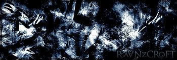
Update, Darker:

Posted: Fri Feb 03, 2006 2:03 pm
by Lijitsu
To bright.
Posted: Fri Feb 03, 2006 2:03 pm
by Phosphorous
Text isnt that great and it could use some depth. I can't tell what's going on either.
Posted: Fri Feb 03, 2006 4:07 pm
by Cuda
abstract mb!? I dont really like it. It just looks like a bunch of brushing and a gradient.
Posted: Fri Feb 03, 2006 4:11 pm
by RaVNzCRoFT
It's not a gradient.

Posted: Fri Feb 03, 2006 6:01 pm
by wes
the only darkness i see in that sig is your name
ravn, seriously dude, you ARE capable of making much better things than this
Posted: Fri Feb 03, 2006 6:05 pm
by RaVNzCRoFT
Updated with a darker version.

Posted: Fri Feb 03, 2006 6:07 pm
by wes
i still believe that the light spots are disturbing
Posted: Fri Feb 03, 2006 6:16 pm
by RaVNzCRoFT
Well your opinion is wrong.
Posted: Fri Feb 03, 2006 6:18 pm
by wes
k ;P
Posted: Fri Feb 03, 2006 7:31 pm
by maca_§
I think you should start doing different styles.
Not saying it's not good, I'm just sick of grunge Sigs.
Posted: Fri Feb 03, 2006 9:47 pm
by lxNicktardxl
Phosphorous wrote:Text isnt that great and it could use some depth. I can't tell what's going on either.
Posted: Fri Feb 03, 2006 9:51 pm
by [TS]
[quote="maca_